
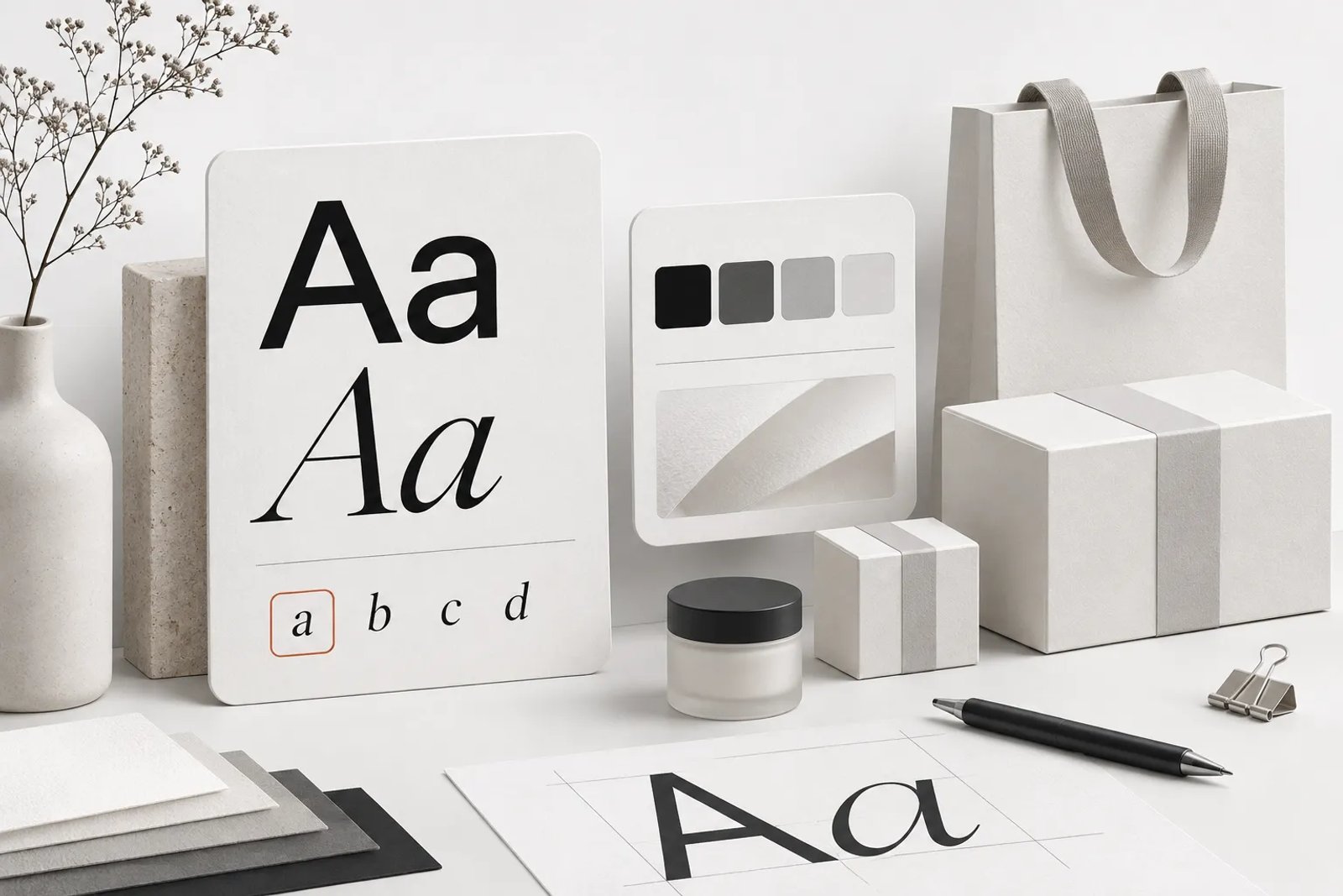
Brand teams planning for 2027 face a growing volume of visual forecasts from agencies, paint manufacturers, type foundries and design studios. AI tools make it easy to reproduce a fashionable look, but deciding whether that look suits a brand still requires judgment. The useful starting point is to understand what each forecast actually says and where it comes from.
This guide focuses on three layers that shape almost every visual decision a brand makes: color, typography and the brand system that holds them together. It collects the signals that are already public as of October 2026, separates confirmed announcements from commentary, and then turns them into practical choices for brand identity, social content and ecommerce visuals.
This guide focuses on color, typography and branding as practical decisions for real projects. Use the directions as material to test against your existing identity, not as a requirement to replace it.
A note on method before we begin. Trends are not rules, and a forecast is not a fact about your audience. Where a claim comes from a specific organization, we name the organization and link the source at the end. Where something is our own reading of the signals, we say so. We have not invented statistics, and we have not included numbers that we could not trace to a public source.
How to read 2027 trend forecasts without getting misled
Before choosing colors or typefaces, consider who produced the forecast and what it was intended to inform. Forecasts serve different audiences and commercial purposes. Reading them in context helps avoid a short-lived visual refresh that weakens the brand over time.
Forecasting agencies look further ahead than you think
Some forecasts are produced by trend-forecasting businesses whose clients are manufacturers, retailers and fashion houses. These forecasts are published early because physical products take a long time to design, source and produce. A color that appears in a forecast for 2027 was often chosen in 2025, because a garment, a sofa or a paint line needs that much lead time.
That timing matters for digital design. When a forecasting agency names a color for 2027, it is telling you what manufacturers have been preparing for, which means that color is likely to appear in retail environments, packaging and product photography during 2027. For a digital brand team, that is a useful signal about the visual context your audience will be living in, not an instruction to repaint your logo.
Paint and coatings companies speak to interiors
Paint brands publish a color of the year for their own customers: homeowners, interior designers and contractors. Their picks reflect what people want to live with on their walls, which tends to favor colors that are calm, flexible and easy to pair. When several paint brands land on related families, such as muted greens or warm neutrals, that tells you something about the general mood of interiors, which in turn affects lifestyle photography, home and decor ecommerce, and the backgrounds people see in social content.
Type commentary comes from practitioners, not panels
Typography trends are rarely announced by a single authority. Instead, they emerge from type foundries releasing new families, design publications reviewing what gets used, and designers sharing what they reach for. That makes type trend writing more opinionated and less coordinated than color forecasting. You should treat it as commentary from people who watch the field closely, not as a forecast with a single official answer.
Branding trend reports often sell a service
Branding trend articles are frequently written by agencies that also sell branding services. That does not make them wrong, but it does mean the emphasis tends to fall on whatever the agency is good at. The most useful branding signals are the ones that appear across many independent sources: a move toward complete brand systems rather than standalone logos, more attention to how a brand behaves across every touchpoint, and a growing concern with authenticity in an era of generated content.
Separate the signal from the product placement
When you read a 2027 trend list, ask three questions. Who published it, and who are their customers? Is the claim about something already announced, or about something the author expects? And does the trend solve a problem your brand actually has? A trend that answers none of those questions well is entertainment, not strategy.
Color trends 2027: what has actually been announced
Color offers some of the most specific early information because several organizations announce their selections well ahead of the year. The following discussion reflects material public by October 2026.
The forecasting view: Luminous Blue
For the official forecast, read WGSN and Coloro’s 2027 color announcement.
WGSN and Coloro named Luminous Blue as their Colour of the Year 2027. The announcement was made in April 2025, which is typical for a forecast aimed at manufacturers who need long lead times. The same release introduced five key colors for Spring/Summer 2027: Luminous Blue, Energy Orange, Pop Pink, Meadowland Green and Clay.
The forecast frames 2027 around interconnectedness, describing connections between opposites such as nature and technology, ancient and contemporary, and online and offline. WGSN's own explanation of the blue draws a line between lapis lazuli, a stone used as the basis of blue pigment for centuries, and cobalt, an ingredient in the batteries that power the current energy transition. In other words, the color is presented as a bridge between craft heritage and technology.
For designers, the useful part is not the name of the color but the reasoning. A saturated, luminous blue that carries both a historical and a technological reference is easy to use in brands that want to feel trustworthy without feeling corporate, and energetic without feeling loud. It also pairs naturally with the warmer key colors in the same release, which gives you a ready-made contrast between cool and warm.
The interiors view: greens, earthy olives and soft neutrals
Paint companies began announcing their 2027 colors in the second half of 2026. Behr named Grounded, described as an olive green that moves through moss, olive and earth tones, as its 2027 Color of the Year. Sherwin-Williams, together with HGTV Home by Sherwin-Williams, named Celery, a soft muted green with subtle yellow undertones. Valspar named Cottage Door, which it describes as a reflective mid-tone neutral blue that combines warm and cool undertones. Dulux named Soulful Sage, a soft grey-green, as its Colour of the Year 2027.
Read together, the paint announcements point toward calm, nature-linked colors: sage, celery, olive and soft blue. These are colors people want around them for years, not weeks. For digital work, that means lifestyle photography, home and decor product imagery, and wellness content are likely to keep leaning toward muted greens and warm neutrals through 2027.
What has not been announced yet
As of October 2026, Pantone has not announced a Color of the Year for 2027. Its announcements usually arrive in early December. The most recent Pantone pick is Cloud Dancer, a white neutral named as the 2026 Color of the Year in December 2025. Any article that tells you Pantone's 2027 color before Pantone announces it is guessing. If you are planning a campaign around Pantone's pick, leave a placeholder in your plan and wait for the official announcement rather than building on rumors.
Benjamin Moore had also not been confirmed in the coverage we reviewed. We will not list a color for any organization that has not published one.
Reading the announcements as a palette rather than a winner
It is tempting to pick one color of the year and run with it. A better approach is to read the announcements as a palette that describes a mood. The 2027 signals so far combine a vivid, technology-flavored blue with a set of soft, nature-linked greens and neutrals. That combination suggests two directions brands can take, sometimes within the same identity.
The first direction is calm and grounded: sage, celery, olive, clay and warm off-whites. This works for brands that want to feel steady, considered and sustainable, and it suits wellness, home, food, education and many service businesses. It is also forgiving in photography, because muted backgrounds let products and people carry the image.
The second direction is luminous and optimistic: saturated blue with warm accents such as orange and pink. This works for brands that want to feel energetic and forward-looking without slipping into neon. It suits technology, creative tools, sport and youth-focused brands, and it gives social content a strong thumb-stopping quality when used against neutral backgrounds.
Many brands will find that the most interesting results come from combining the two: a calm base palette with a single luminous accent used sparingly for calls to action, highlights and moments of emphasis.
Color directions to explore in 2027
The following directions are our reading of the published signals. They are starting points for exploration, not prescriptions.
Grounded greens as a new neutral. Several paint brands chose greens that behave almost like neutrals. In brand work, a desaturated sage or olive can replace grey or beige as the quiet background color, giving layouts warmth without competing with content. It pairs well with off-white, warm wood tones and deep charcoal.
Luminous blue as the accent that does the work. A bright, clear blue can carry calls to action, links, key data points and highlighted product features. Because blue is widely associated with trust, it can make an energetic palette feel reliable. The key is restraint: one luminous accent, used consistently, will read as a brand signature, while five competing accents will read as noise.
Warm earth as connective tissue. Clay, terracotta and soft brown tones appear in both forecasting and interiors signals. They work as a bridge between cool blues and greens and warmer skin tones in photography, which makes them useful in fashion, beauty and food content.
Soft optimism through pink and orange. Pop Pink and Energy Orange in the forecasting palette suggest that warmth and playfulness are not going away. Used in small doses, these colors can give an otherwise calm palette a sense of personality, especially in social content and packaging.
White and off-white as deliberate choices. Pantone's 2026 pick of a white neutral, together with the general move toward calm palettes, is a reminder that white space and soft off-whites are design decisions, not empty space. In 2027, many brands will benefit from more generous negative space rather than more color.
How to test a 2027 color before committing
Before adopting a trend color, test it in the places your brand actually lives. Put it next to your existing logo and see whether it supports or fights the mark. Use it as a background behind your real product photography, not behind stock images. Check how it looks on the screens your audience uses, including dim phone screens in the evening. Print a sample if you have packaging or print collateral, because many blues and greens shift noticeably between screen and paper.
Most importantly, test the color in context with text. A color that looks beautiful as a swatch can fail badly as a background for body copy. That leads directly into accessibility, which we cover in its own section below.
Typography trends 2027: the directions designers are reaching for
Typography signals are less centralized than color forecasts. Recurring themes appear in type publications, foundry journals and design commentary, but much of that material concerns 2026. This guide treats those themes as context for 2027 and identifies them accordingly, rather than presenting them as new confirmed forecasts.
Expressive type returns after years of neutral grotesques
For much of the past decade, many brands converged on clean, neutral sans serifs. Commentary on 2026 font trends describes a swing away from that uniformity toward more expressive type: heavier display weights, more personality in letterforms, and a willingness to let typography carry the brand voice rather than staying invisible. This is a 2026 signal, and it is likely to continue into 2027 as brands look for ways to stand out in feeds full of similar layouts.
For practical work, this does not mean abandoning legible text faces. It means pairing a dependable reading face with a display face that has character, and using the display face where it can make an impression: headlines, campaign titles, packaging hero text and social cover images.
Serifs, especially soft and warm ones
Serif typefaces have been returning to branding for several years, and the commentary for 2026 highlights soft serifs in particular: rounded, friendly serif designs that feel warm rather than formal. These faces show up frequently in lifestyle, hospitality and wellness branding, which lines up neatly with the calm, nature-linked color direction described above.
A soft serif paired with a muted green or clay palette is one of the most coherent combinations the current signals suggest. It reads as considered and human, which is exactly the impression many brands want to make in a period of heavy AI-generated content.
Variable fonts move from novelty to infrastructure
Variable fonts store many styles in a single file and let designers adjust properties along axes such as weight, width, slant, italic and optical size. Google Fonts' own glossary describes axes as adjustable aspects of a design, each with a default, a minimum and a maximum value, and notes that designers can map almost any design property to an axis. Some typefaces expose expressive custom axes as well, which type commentary has pointed to as a driver of more playful typography.
For brands, the practical benefit of variable fonts is consistency with flexibility. One family can handle a delicate caption, a dense product label and a bold campaign headline without introducing new typefaces. That makes it easier to keep a brand system coherent across many formats, which is the central branding theme for 2027 discussed below.
Handwriting and human marks as a counterweight to generated content
Commentary on 2026 type trends also notes a renewed interest in handwritten and hand-drawn lettering, partly as a response to the volume of AI-generated imagery. A hand-drawn word, an imperfect stroke or a signature-style mark signals that a person made a choice. Expect this to continue in 2027, especially in food, craft, education and creator-led brands.
The practical lesson is not to replace your typeface with a script, but to reserve a small space for human marks: a handwritten note on packaging, a lettered word in a campaign, a signature on a founder's letter. These touches are memorable precisely because they are rare.
Retro curves and seventies influences
Several type round-ups for 2026 mention retro-leaning curvy serifs and seventies-inspired display faces. These styles feel warm and nostalgic, and they pair well with earthy palettes. They also carry a risk: retro looks can date quickly when everyone adopts them at once. Use them where nostalgia is part of the story, such as heritage brands, food and drink, music and fashion, and be cautious when the brand needs to feel timeless.
Kinetic type in social and video
Kinetic typography, where letters move, stretch or respond to sound, has become common in short-form video and social content. For 2027, the interesting development is less about motion for its own sake and more about motion that respects brand type: a variable font animating along its weight axis, for example, keeps motion on-brand instead of introducing an unrelated animated typeface.
Typography directions to explore in 2027
Based on the signals above, here are practical directions to test. As with color, these are starting points.
A dependable text face plus one expressive display face. Choose a highly legible face for body text, interfaces and small labels, then pair it with a display face that carries personality for headlines and hero moments.
Soft serifs for warmth. If your palette leans calm and natural, a soft serif can express the same mood in type. It works particularly well in packaging, editorial content and wellness or lifestyle branding.
One variable family for range. If you want a single typographic voice across many formats, a variable family can stretch from compact labels to bold display without changing families.
Reserved human marks. Keep a small, deliberate place for handwriting or hand lettering, and use it consistently so it becomes part of the brand rather than decoration.
Motion that respects the system. In video and social, animate the brand's own type rather than adding unrelated animated fonts.
Branding trends 2027: systems over single assets
Branding commentary varies widely, yet repeatedly emphasizes complete systems over isolated logos. Reports about agencies in 2026 describe coordinated visual, verbal and interaction choices across digital touchpoints. The expectation that brands work this way may strengthen in 2027; that remains an interpretation of the available signals.
Why systems matter more now
The number of touchpoints a brand has to cover keeps growing: social posts in several aspect ratios, short video, marketplace listings, email, packaging, presentations, ads and interface screens. A logo and a color code are not enough to keep all of that consistent. A brand system defines how color, type, imagery, layout, motion and tone of voice work together, so that anyone producing content can make on-brand decisions without asking for approval every time.
AI tools increase the pressure on systems. When anyone can generate an image in seconds, the difference between a coherent brand and a scattered one is whether the generated assets follow shared rules. Brands that have clear systems will get more consistent output from AI tools; brands that do not will get a flood of assets that each look fine and together look like several different companies.
Authenticity and human voice
Branding commentary also emphasizes honesty and human voice: brands that sound like people, admit mistakes and communicate plainly. This connects to the type and color signals above. Warm palettes, soft serifs and hand-drawn marks are visual expressions of the same desire to feel human. For 2027, expect more brands to pair polished systems with deliberately human details.
Meaningful difference over trend-chasing
Some branding writing cites research from brand valuation firms suggesting that brands perceived as meaningfully different tend to grow their value faster than brands that are not. We mention this not to quote a statistic but to underline a principle: following trends is only useful when it helps the brand stand out in its own category. If every competitor adopts the same sage green and soft serif, the brand that does something considered and distinct will be remembered.
Branding directions to explore in 2027
Write the system down. Document color roles (background, text, accent, warning), type roles (display, heading, body, caption), image style, layout grids and tone of voice. A system that lives only in a designer's head cannot be followed by a team or by AI tools.
Design for every format from the start. Plan how the identity works in square, vertical and horizontal formats, in motion and in static images, on marketplace listings and on packaging.
Choose one signature element. A single distinctive color, a recognizable typographic treatment or a consistent image style often does more for recognition than a complex logo.
Keep room for people. Reserve space for real photography, handwritten touches and plain-language copy so the brand does not feel generated.
Review consistency regularly. Systems drift over time as more people and tools produce content. Schedule regular reviews of live assets against the system.
Applying 2027 trends across brand, social and ecommerce
A trend becomes useful when it informs a concrete decision in a particular channel. A color or typeface that works for a campaign may need different treatment in a product listing. The following sections consider brand identity, social content and ecommerce separately.
Brand identity
Identity work is where restraint matters most, because identity decisions are meant to last longer than a single trend cycle. Instead of rebuilding an identity around a 2027 color, consider updating the supporting palette. Keep the core brand color, then add a 2027-inspired secondary or accent color that refreshes the system. A brand with a deep navy core could add a luminous blue accent for digital highlights. A brand with a neutral palette could introduce a muted sage as a new background color.
For typography, a similar approach works. Keep the primary typeface if it still serves the brand, and introduce a display face or a variable family that adds expressive range for campaigns. If the current typeface is genuinely outdated or illegible, a broader update may be justified, but that is a strategic decision rather than a trend decision.
Document every change in the brand guidelines, including which roles new colors and typefaces play. If the guidelines say that luminous blue is only for calls to action, everyone producing content knows not to use it as a background.
Social content
Social platforms reward contrast, clarity and recognizability in a fast-moving feed. Trend colors can help here, especially luminous accents against calm backgrounds. A muted sage background with a single bright blue headline or button stands out in a feed without looking like an ad from five years ago.
Typography on social needs to work at small sizes on phone screens. Expressive display faces are great for short headlines, but body copy in images should stay simple and large. Kinetic type can make short videos more engaging, as long as it uses the brand's own typefaces and does not sacrifice readability.
Consistency across a series matters more than any single post. When you plan a month of content, decide which colors, type treatments and layouts repeat so the audience learns to recognize the brand before reading the caption. A repeated layout with a consistent accent color often does more for recognition than a different trendy look every day.
Ecommerce visuals
Ecommerce imagery has to sell a product clearly before it expresses a trend. Calm backgrounds in muted greens, warm neutrals and off-whites make products easier to read, and they align with the interiors signals for 2027. For lifestyle shots, nature-linked palettes and soft natural light fit the general mood without distracting from the product.
Accent colors are useful for badges, labels and promotional graphics. A luminous blue or energetic orange can mark a new arrival or a featured item, but it should be used consistently across the store so shoppers learn what it means.
Typography in ecommerce must be legible at thumbnail size. Product names, prices and key benefits should use the brand's most readable face. Expressive display type belongs on campaign banners and landing pages, not on product listing details.
When you produce many product images at once, the main risk is inconsistency: slightly different background tones, different text placement and different crops across a catalog. A shared visual rule set, applied to every image, keeps the catalog looking like one store.
Packaging and print
Packaging is where screen colors meet the physical world, and where trend colors often behave differently than expected. Greens and blues can shift significantly between screen and print. Always proof physical samples before committing, and consider how colors look under the lighting conditions of the places your product is sold.
Soft serifs and hand-drawn marks tend to work well on packaging, where they can be seen at a comfortable reading distance and where human touches are appreciated. Kinetic type obviously does not apply, but the same principle of respecting the brand system does.
Presentations and internal materials
Brand systems often break down in presentations and internal documents, where teams improvise. Updating templates with 2027 color roles and type styles is a low-effort way to make the whole organization look more coherent. It also helps when decks are shared externally with partners and investors.
Accessibility: making 2027 colors and type work for everyone
Expressive typography and trend-led palettes still need to be readable. Accessibility belongs within the choice of color, type and layout, rather than being deferred to a separate stage.
Contrast requirements
Check the exact requirements and exceptions in the W3C contrast guidance.
The Web Content Accessibility Guidelines set minimum contrast ratios for text. Under success criterion 1.4.3 (Contrast Minimum, Level AA), normal text needs a contrast ratio of at least 4.5:1 against its background, and large text needs at least 3:1. Large text is commonly defined as 18 point, or 14 point when bold. The enhanced criterion at Level AAA raises the bar to 7:1 for normal text and 4.5:1 for large text. Meaningful interface components and graphics fall under a separate non-text contrast criterion that requires at least 3:1 against adjacent colors.
Some text is exempt, including logos and brand names, purely decorative text and text in inactive interface components. However, exemptions should not be used as an excuse for unreadable marketing copy. If people need to read it to understand the offer, it needs enough contrast.
What this means for 2027 palettes
Many of the 2027 signals point toward muted, mid-tone colors. Mid-tones are beautiful, but they often fail contrast requirements when used as text colors on light backgrounds or as backgrounds behind white text. A muted sage background with white text is a common example of a combination that looks pleasant and reads poorly.
The solution is to assign roles. Use muted greens, celery and soft blues as background and surface colors, and pair them with deep text colors such as charcoal, deep olive or navy. Reserve luminous accents for large elements, icons and buttons, and check the contrast of any text placed on them.
Legibility beyond contrast
Contrast is only one part of legibility. Expressive display faces, tight letter spacing and heavy weights can reduce readability, especially at small sizes. Keep expressive typography for large headlines, and use a highly legible face for anything people need to read in detail. Avoid placing important text over busy photography, and give text enough size and line spacing on mobile screens.
Color should never be the only way information is communicated. If a sale price is marked only by a color change, some people will not notice it. Pair color with labels, icons or position.
A simple accessibility checklist for trend work
Check text contrast for every text and background pair in the palette. Test headlines and body text on real phone screens. Make sure buttons and links have enough contrast and a visible focus state. Avoid relying on color alone to communicate meaning. Keep body text in a legible face at a comfortable size. Document accessible color pairs in the brand guidelines so the team does not have to recheck them every time.
Planning your 2027 visual refresh step by step
Trend knowledge is only useful if it leads to a clear plan. Here is a step-by-step approach that works for small teams and agencies alike.
Step 1: Audit what you already have
Collect your current logo, palette, typefaces and a representative sample of recent content across channels. Note what is working, what feels dated and where consistency has slipped. Many teams discover that their biggest problem is not an outdated color but inconsistent use of the colors they already have.
Step 2: Decide what should not change
Identify the elements that carry recognition, such as a core color, a logo shape or a signature typeface. These are usually worth keeping. A refresh that throws away recognition to chase a trend often costs more than it gains.
Step 3: Choose a small number of changes
Pick one or two changes inspired by 2027 signals: a new accent color, a new background neutral, a display face or a more generous use of white space. Small, consistent changes are easier to roll out and easier for the audience to accept.
Step 4: Test in context
Apply the changes to real assets in your main channels. Check them on phones, on the platforms where your audience sees them and in print where relevant. Check accessibility for every text and background pair.
Step 5: Document and share
Update your brand guidelines with the new roles, accessible color pairs and type rules. Share examples of correct and incorrect use. If you use AI tools, update the rules they follow, such as your brand guide, so generated assets match.
Step 6: Roll out in waves
Update the highest-visibility assets first: website hero areas, social profile images, key product images and current campaign materials. Then update templates so new content follows the system automatically. Leave low-visibility legacy assets for later.
Step 7: Review regularly
Schedule a review of live content every month or quarter to catch drift. Trends will keep moving, and your system should evolve deliberately rather than by accident.
A closer look at the Spring/Summer 2027 key colors
The five key colors published alongside Luminous Blue are worth looking at one by one, because each suggests a different use in brand and content work. The notes below are our practical interpretation, not part of the forecast itself.
Luminous Blue. This is the anchor of the forecast and the most versatile of the five for digital work. It reads as clear and confident on screens, and it carries the trust associations that blue usually brings. Use it for interactive elements, key highlights and campaign hero moments. Avoid using it for long passages of text on dark backgrounds unless you have checked contrast carefully.
Energy Orange. Orange brings warmth and urgency, which makes it effective for limited-time messages, new arrivals and calls to action in consumer brands. Because it is so attention-grabbing, it works best in small areas. A palette that combines a calm base with a touch of orange can feel lively without feeling aggressive.
Pop Pink. Pink has moved well beyond any single audience in recent years, and in a 2027 palette it adds playfulness and optimism. It pairs especially well with clay and off-white, and it can soften a technology-leaning palette built around blue.
Meadowland Green. This green connects the forecasting palette with the greens chosen by several paint brands. It suggests freshness, nature and growth, and it works for sustainability messages, food, wellness and outdoor categories. In digital layouts it can serve as a background or as a secondary accent.
Clay. Clay is the grounding color of the set. It connects warm skin tones, natural materials and earthy photography, and it can act as a neutral that feels warmer than grey or beige. It is a useful bridge between the cool blue and the warm accents.
Worked example: building an accessible 2027 palette
To show how the principles in this guide fit together, here is a worked example for a fictional home goods brand called Fieldhouse. The brand currently uses a deep charcoal and a cream background, with a classic serif logo.
Fieldhouse wants to feel current in 2027 without losing the recognition it has built. The team keeps the charcoal and the serif logo unchanged. It introduces a muted sage as a new background color for lifestyle sections of the website and for social post backgrounds, because sage aligns with the interiors signals and suits the product category. It adds a luminous blue as an accent reserved for buttons and new-arrival badges, so the blue always means the same thing.
Next, the team defines text pairs. Body text stays charcoal on cream and charcoal on sage, and the team checks both pairs against the 4.5:1 requirement for normal text. White text is not allowed on sage, because the combination looks soft but reads poorly. On blue buttons, the team uses white text at a large, bold size and checks the pair against the requirements for large text.
For typography, Fieldhouse keeps its serif for headlines and pairs it with a soft, highly legible sans serif for body text and product details. For seasonal campaigns, the team creates a hand-drawn display word that appears only on campaign headlines and packaging, so it stays special.
Finally, the team writes all of this into its guidelines and its brand guide, produces a small test set of assets, and reviews the set together for consistency before rolling the changes out across the website, social accounts and packaging. The result is a brand that feels refreshed for 2027 while remaining recognizably itself.
Typography pairings by mood
If you are choosing a 2027 type direction, it can help to start from the mood you want rather than from a list of fashionable fonts. These pairings describe categories of type rather than specific typefaces, so you can choose fonts that fit your licensing and language needs.
Calm and considered. A soft serif for headlines with a humanist sans serif for body text. This pairing suits wellness, home, education and lifestyle brands, and it sits comfortably with muted greens and warm neutrals.
Bright and optimistic. A bold geometric or rounded sans serif for display with a neutral sans serif for text. This works with luminous blue and warm accents for technology, sport and youth-focused brands.
Crafted and personal. A classic serif for text with hand-lettered accents for headlines and packaging. This suits food, craft and founder-led brands that want to emphasize human making.
Nostalgic and warm. A retro curvy display serif for campaigns with a simple sans serif for everything else. This suits heritage, music and hospitality brands, provided the retro face is used sparingly.
Common mistakes to avoid with 2027 trends
Repainting the whole brand around one color of the year. Colors of the year are signals about mood, not instructions for identity. Use them as accents or supporting colors unless there is a strategic reason to do more.
Treating rumors as announcements. As of October 2026, Pantone has not announced its 2027 color. Do not build campaigns around predictions presented as facts.
Ignoring contrast. Many 2027 colors are mid-tones that fail as text colors. Check every text and background combination.
Adding too many typefaces. Expressive type is appealing, but a system with five display faces is not a system. One text face and one display face, or one variable family, is usually enough.
Copying a trend instead of adapting it. If every brand in your category adopts the same palette, sameness becomes the problem. Adapt trends to your own story.
Letting AI output drift from the system. Generated assets are only consistent if the rules are explicit. Keep your brand guide and guidelines up to date, and review sets of assets together rather than one at a time.
Forgetting print and packaging. Screen colors and printed colors differ. Proof physical samples.
Industry notes: how the 2027 signals fit different categories
The same signals land differently depending on the category. Here are brief notes for several common categories, based on our reading of the published announcements.
Wellness, beauty and personal care
Calm greens, clay and warm off-whites align naturally with wellness and beauty. Soft serifs reinforce a gentle, considered voice. Use a single warm accent, such as a soft pink, for highlights. Keep product photography bright and natural.
Food and drink
Earthy tones and retro curves suit many food and drink brands, especially those with heritage or craft stories. Hand-drawn lettering can add warmth to packaging and menus. Make sure appetizing product colors remain the focus; backgrounds should support the food, not compete with it.
Technology and software
Luminous blue fits technology brands well, especially when paired with calm neutrals that keep interfaces readable. Variable fonts help software brands keep one typographic voice across product interfaces, documentation and marketing. Use expressive type sparingly in product contexts, where clarity comes first.
Fashion and lifestyle
Fashion brands often move ahead of other categories, and the forecasting palette, including Energy Orange and Pop Pink, offers room for bolder seasonal expression. Keep the core identity stable and let seasonal campaigns carry the trend colors.
Home and interiors
The paint announcements are directly relevant here. Greens such as sage, celery and olive, together with soft blues and warm neutrals, will be familiar to customers who follow interiors. Lifestyle imagery that reflects these palettes will feel current.
Education and nonprofits
Calm, trustworthy palettes and highly legible type are usually the right foundation. A single optimistic accent color can add warmth without undermining credibility. Accessibility is especially important for audiences of all ages and abilities.
Agencies working across many brands
Agencies face a particular challenge: applying trends without making every client look the same. The answer is usually to treat trends as a shared vocabulary of options while anchoring each client in its own system. Keeping a separate brand guide for each client brand makes it easier to explore 2027 directions without crossing wires between brands.
Frequently asked questions
What is the color of the year for 2027?
It depends on who you ask. WGSN and Coloro named Luminous Blue as their Colour of the Year 2027. Paint brands have announced their own picks, including Behr's Grounded, Sherwin-Williams' Celery, Valspar's Cottage Door and Dulux's Soulful Sage. As of October 2026, Pantone has not announced its 2027 color.
When will Pantone announce its 2027 Color of the Year?
Pantone usually announces its Color of the Year in early December. Its 2026 pick, Cloud Dancer, was announced in December 2025. Check Pantone's official channels for the 2027 announcement rather than relying on predictions.
What are the main color trends for 2027?
Our reading of the published signals is that 2027 combines calm, nature-linked colors such as sage, celery, olive and clay with a vivid, luminous blue and warm accents such as orange and pink. Many brands will use the calm colors as a base and the luminous colors as accents.
What are the typography trends for 2027?
Commentary on 2026 type trends, which is the best available signal for 2027, points to more expressive display type, the return of soft serifs, wider use of variable fonts, hand-drawn lettering as a human counterweight to generated content, retro curves and kinetic type in video. Pair an expressive display face with a highly legible text face.
What are the font trends for 2027 for branding?
For branding, the most useful font directions are a dependable text face paired with one distinctive display face, soft serifs for warm brands, and variable families that give range without adding typefaces. Choose fonts that fit the brand's personality and work at small sizes.
What are the branding trends for 2027?
The strongest branding theme is building complete brand systems rather than standalone logos, so that every touchpoint stays consistent. Authenticity and a human voice remain important, and brands that are meaningfully different in their category will stand out more than brands that follow trends closely.
Should I change my brand colors for 2027?
Usually not completely. Keep the colors that carry recognition, and consider adding a 2027-inspired accent or background color with a clearly defined role. Test it in context and check accessibility before rolling it out.
How do I make trend colors accessible?
Assign colors to roles and check contrast. Under WCAG success criterion 1.4.3, normal text needs at least 4.5:1 contrast and large text at least 3:1. Mid-tone trend colors often work better as backgrounds with deep text colors than as text colors themselves.
How can AI help apply design trends consistently?
AI-assisted work is easier to evaluate when the brand rules are explicit. Prepare the approved palette, typography direction and visual references before starting a Saharan AI project. Compare each proposed direction with those rules and review the final series for consistency.
Are 2026 trends still relevant in 2027?
Many are. Type and branding trends evolve gradually, so the 2026 signals around expressive type, soft serifs and brand systems are likely to carry into 2027. Color forecasts are more time-specific, which is why we focus on announcements that explicitly name 2027.
Turn the refresh into finished creative assets
You can explore the visual direction yourself in Saharan AI or commission finished creatives for the refresh. Keep the agreed palette, typography direction and placement requirements in the brief so the final campaign assets express one coherent brand decision.
Explore a brand refresh with Saharan AI
Choose a limited change: a new campaign palette, a typographic direction or a different image treatment. Saharan AI gives you a place to begin creative exploration or discuss a broader production brief.
Keep your established brand rules in the brief and test the direction in a real placement. Start your visual-refresh project with one representative asset before extending the change across the brand.
Where creative vision is brought to life
Matched in 24h. Delivered by professionals.
50+ AI models. One creative workspace.