
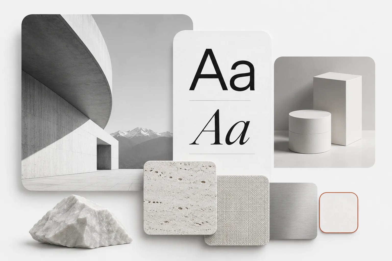
Searching for design inspiration beyond Pinterest often means finding a source that does one particular job better: documenting a project, collecting website examples, showing typography in context or organizing references without a busy feed. This guide groups inspiration sites by those jobs and explains a workflow for turning scattered examples into a useful design direction.
The sites below are grouped by the research job they support, rather than ranked against one another. A typography archive and a portfolio community answer different questions. Treat the descriptions as a starting point and check the current service before relying on a particular feature.
The short version
For a quick overview, start with these points.
Pinterest is a strong place to start broad visual exploration, but most designers combine it with sources that are more specialized. For collecting and organizing references, people use tools such as Are.na, Savee, Cosmos, Designspiration and Milanote. For finished projects with process, they look at portfolio communities such as Behance and Dribbble. For websites and app interfaces, they use galleries such as Awwwards, Godly, One Page Love, Httpster, Land-book, Lapa Ninja and Mobbin. For curated daily feeds, Muzli and Abduzeedo are common. For typography, Fonts In Use, Typewolf and Letterform Archive are useful. For identity work, Brand New and Logo Design Love cover logos and brand systems. For packaging, Dieline focuses on the packaging community. And for references that do not look like everything else in the feed, museum collections and public archives such as the Rijksmuseum and the Library of Congress are worth the slower browsing.
The bigger time sink is rarely finding images. It is turning them into a direction: knowing where each reference came from, why it fits the brief, and how it translates into color, type, layout and imagery. That is the part a research workflow, and tools built for research, can speed up.
Why designers look beyond Pinterest
Pinterest presents itself as a place to discover ideas, shop and plan. Its own description centers on Pins organized into boards, alongside expert selections, personalized boards, visual search and collage tools. Together, these features make it a broad starting point for exploring visual directions.
The reasons designers add other sources are practical rather than critical.
The first is context. A saved image on a discovery board often travels far from where it was first published. When you need to know who made a piece of work, for which client, under what constraints, and why a decision was made, you usually need the original source: a portfolio page, a case study, a brand announcement or an archive record.
The second is focus. A general discovery feed mixes interiors, fashion, recipes and graphic design. When you are designing a checkout flow or a typeface pairing for a book cover, a source that only shows that kind of work saves time and gives you more comparable examples.
The third is freshness and originality. Popular images circulate widely. If your references come from the same feed as everyone else's, your work risks looking like everyone else's. Archives, museum collections and niche communities offer material that has not been pinned a million times.
The fourth is reuse and permissions. Some projects need references only for direction, while others need images you can actually use. Knowing which sources are for inspiration and which are for licensed or public-domain material keeps you out of trouble later.
None of this makes Pinterest less useful. It means treating it as one tool in a research kit rather than the whole kit.
Visual collection and moodboarding tools
These services are closest to Pinterest in purpose: saving images and links, organizing collections and revisiting them later. Their approaches differ in curation, contextual information and collaboration.
Pinterest organizes ideas into Pins and boards. According to its about page, you can discover ideas through featured boards picked by experts and AI-powered boards tailored to your taste, use visual search when you do not have the words for what you want, turn saved ideas into visual collages, and shop items from your boards.
Where it fits: broad, early exploration of mood, color, styling and subject matter, especially for lifestyle, fashion, interiors, food and consumer products. It is a good way to see how a theme is expressed across many kinds of imagery before you narrow down.
What to check: because images are often re-saved from other places, trace important references back to their original source before you cite them or share them with a client.
Are.na
Are.na describes itself as a place to save content, create collections over time and connect ideas, privately or with other people. Content lives in what it calls channels, which are editable, arrangeable and searchable containers. Its about page lists capturing photos, notes, files and web pages, arranging content in channels, searching across your own channels, your network and the whole platform, and reusing existing content in your own collections. It also mentions collaborating on specific channels, exporting channels as PDF, ZIP and HTML, setting channels to open, closed or private, an API, and saving links or text snippets while browsing.
Where it fits: slow, cumulative research where connections between ideas matter more than visual density, such as long-running brand projects, editorial research, or building a shared reference library for a team or a class.
What to check: Are.na is built around connecting ideas rather than around an endless visual feed, so expect to do more of the curation yourself.
Savee
Savee is a visual-reference collection service. It is useful when you want to collect a focused set of images and review their visual relationships. Evaluate the current curation, organization and collaboration options against the way your team researches.
Where it fits: designers who want a feed curated by other designers rather than a general consumer mix, and teams that want one shared visual library.
What to check: as with any curated feed, the curation reflects a particular taste. That is the point, but it is worth balancing with sources outside the design community when your brief targets a different audience.
Cosmos
Cosmos calls itself your space for inspiration. Its homepage lists searching by color, organizing inspiration into collections for every project, outfit or space, finding similar elements from an image you love, collaborating on collections with others, and saving inspiration from anywhere as you browse. It also offers an option to show, blur or hide images flagged as AI-generated, and it includes shopping from brands.
Where it fits: building project-specific collections, especially when you work by color or want to find more images like one strong reference. The option to filter AI-generated images can help when a brief calls for photographic or handmade references.
What to check: the shopping features make it a mix of inspiration and commerce, so keep research collections separate from product browsing if that distracts you.
Designspiration
Designspiration describes itself as an image and color search engine for creating mood boards and finding art, design, logos, photography, app and UI inspiration. Its homepage invites you to save ideas and inspiration, including colors, links, notes and screenshots, with a browser extension.
Where it fits: quick searches by color and visual category when you are assembling a mood board, and saving references with notes.
What to check: as with any search-driven library, the results reflect what users have saved, so trace key images back to their source.
Milanote
Milanote describes itself as an easy-to-use tool for organizing creative projects into visual boards. Its homepage says you can combine notes, images, videos, sketches and more, save links or content from the web in a single click, gather project information and tasks in one place, and invite others to edit, comment or view boards. It lists use cases including moodboards, storyboards and project plans for design and illustration, and shot lists and moodboards for photography.
Where it fits: Milanote is less a source of inspiration than a place to arrange it. It suits teams that want the moodboard, the notes and the plan side by side, and that present boards to clients.
What to check: you still need sources to fill the board. Milanote is where research goes, not where it comes from.
Portfolio communities
Portfolio communities present completed work by designers and studios, often with process material and project explanations. They are useful for understanding a complete identity, campaign or product rather than a single image.
Behance
Behance is a portfolio community where designers and studios present finished projects and supporting process material. Use complete case studies to understand how a visual direction develops across several assets.
Where it fits: full project case studies across branding, illustration, photography, motion, product and interface design, often with sketches, systems and applications shown together. It is especially useful for seeing how a visual identity extends across many touchpoints.
What to check: projects are presented by their creators, so they show the work in its best light. For client context and results, look for the creator's own notes in the project description.
Dribbble
Dribbble's about page says it began in 2009 as a small, invite-only space for designers to share work and feedback, opened to all designers in 2021, and launched the Dribbble Marketplace in 2024. It describes its mission as helping professional designers earn a living doing work they take pride in, and it says it has moved from an ad-based model to revenue sharing.
Where it fits: interface details, icons, illustration and visual exploration, often posted as single shots or short sets. It is a good place to explore styles and micro-interactions and to find designers to hire.
What to check: many shots are concepts or excerpts rather than shipped products. When you need proof that a pattern works in production, look for live products or galleries of shipped screens.
Website and interface galleries
Specialist galleries help you compare relevant examples when designing a website, landing page or app. Some emphasize craft and experimentation; others prioritize a broad record of products that have actually shipped.
Awwwards
Awwwards describes itself as awards that recognize and promote the talent and effort of the best developers, designers and web agencies in the world. Its site organizes recognized work into honors such as Sites of the Day, Sites of the Month and Sites of the Year, and lets you browse by category, such as e-commerce, architecture, restaurant and hotel, and fashion, and by technology, such as WebGL, 3D, GSAP, Framer and Webflow.
Where it fits: ambitious, interaction-heavy and experimental web design, and staying current with what the web design community recognizes.
What to check: award-oriented work often prioritizes craft and novelty. When your brief is a conversion-focused page or an accessible public service, balance it with galleries of everyday, high-performing sites.
Godly
Godly calls itself the best design inspiration on the internet and organizes its gallery into categories such as web, interface, branding, motion, illustration, posters and print. Its navigation also lists launch videos, websites, Open Graph images, app screenshots and app icons, plus a jobs board.
Where it fits: a fast scroll through polished, contemporary web and brand work, with categories that go beyond full websites into launch videos and social images.
What to check: the gallery is curated for visual quality, so check how a design behaves on a real device before borrowing an interaction.
One Page Love
One Page Love describes itself as a showcase of one-page websites, templates and resources since 2008. Its site lets you browse by category, such as portfolio, landing page, digital product, app and event, by style, such as minimal, typographic, illustrative and retro, and by platform, such as Webflow, WordPress, Framer and Shopify.
Where it fits: single-page sites, launch pages, portfolios and event pages, especially when you want to filter by the platform you plan to build on.
Httpster
Httpster describes itself as a gallery of creative website design ideas and examples of award-winning sites.
Where it fits: a compact, curated stream of web design for quick scanning when you want a sense of current visual directions.
Land-book
Land-book describes itself as a curated website design gallery for creatives, with hand-picked website design inspiration updated daily.
Where it fits: browsing many contemporary marketing sites in one place, particularly for landing pages and product sites.
Lapa Ninja
Lapa Ninja describes itself as a library of more than 7,300 landing page designs from portfolios, agencies and startups, with screenshots and videos, across categories including SaaS and e-commerce.
Where it fits: landing page structure, section patterns and hero layouts when you are planning a page rather than looking for a mood.
Mobbin
Mobbin describes itself as a design reference library for apps and sites, stating 621,500 shipped screens with new additions every week. Its homepage organizes the library into apps, sites, screens, flows, animations and UI elements, and it offers access for AI agents through an MCP connection on its Pro and Team plans.
Where it fits: product design research where you need to see how real, shipped products handle onboarding, paywalls, settings, checkout or empty states, and to compare whole flows rather than single screens.
What to check: shipped screens tell you what companies did, not why or how well it performed. Pair them with your own product goals and testing.
Curated feeds and daily inspiration
Some sources are less about searching and more about staying in the loop. They bring a stream of work to you.
Muzli
Muzli describes itself as a design inspiration hub and a new-tab browser extension that delivers design stories and inspiration. Its site also lists collections, a color tool, a blog and a design jobs board.
Where it fits: a low-effort way to see a curated mix of design news and visual work every time you open a browser tab.
Abduzeedo
Abduzeedo describes itself as design inspiration since 2006, publishing branding, typography, packaging, editorial and digital design from studios around the world every day. Its collections include branding, typography, packaging, editorial design, graphic design, illustration, 3D, photography, architecture, UI and UX, web design, motion and fashion.
Where it fits: case-study style posts on recent branding and packaging projects, useful when you want to read about a project rather than just see it.
Typography sources
Type is one of the hardest things to judge from a single pinned image. These sources show typefaces in real use and in historical context.
Fonts In Use
For the archive’s scope and approach, see Fonts In Use’s introduction.
Fonts In Use describes itself as an independent archive of typography, searchable and indexed by typeface, format and topic. Its index includes formats such as branding and identity, books, posters and flyers, packaging, web, signs and social media, and topics from music and fashion to food and beverage and science.
Where it fits: seeing how a specific typeface behaves in real applications, finding type for a particular format or industry, and checking whether a pairing has been used successfully before.
Typewolf
Typewolf's about page says it was launched in June 2013 by designer Jeremiah Shoaf, who wanted to show how real type performs on actual websites rather than in pangram samples, and that the site is written from the perspective of someone who uses type in day-to-day work. It describes Typewolf as independent, featuring typefaces from all foundries. Its navigation lists trending type, font lists, lookbooks, a checklist, free fonts and learning resources.
Where it fits: choosing and pairing type for websites, with live examples and practical guidance.
Letterform Archive
Letterform Archive describes itself as a nonprofit center for inspiration, education and community in the graphic arts. Its site lists named collections, exhibitions, an online archive, workshops, lectures and publishing. At the time of writing, its Online Archive page said it was temporarily offline for scheduled maintenance, so check its status before planning research around it.
Where it fits: deep historical references in lettering, type design, printing and graphic design, useful when you want a direction rooted in craft rather than in current trends.
Branding and logo sources
Brand New
Brand New, a division of UnderConsideration, describes itself as opinions on corporate and brand identity work. Its site lets you browse identity projects by industry, by tags such as sans serif, monogram or packaging, by popularity and by editorial category, including reviewed, noted and before-and-after posts.
Where it fits: understanding how identities change in rebrands, and reading critique that explains what works and what does not, which helps when you present your own decisions to a client.
Logo Design Love
Logo Design Love describes itself as a library of identity design since 2008, covering logos, symbols and marks and the stories behind them. Its homepage features logo histories and evolutions, a collection of identity style guides from around the world, and a book on creating brand marks, revised for 2026.
Where it fits: learning the reasoning behind well-known marks and studying identity style guides when you are building a brand system.
Packaging sources
Dieline
Dieline describes itself as a creative platform dedicated to serving the global packaging community, founded in 2007 by Andrew Gibbs, with a mission to connect and inspire packaging professionals while advocating for more sustainable solutions. Its site organizes work by category, including food, beverage, beauty and health, spirits, sustainable packaging and student and concept work, and it runs the Dieline Awards.
Where it fits: category research for packaging, including how competitors in a shelf category handle hierarchy, materials and sustainability messages.
What to check: concept and student projects are labeled separately from launched products, which matters when you need examples that survived production.
Museums and public archives
Museum and library collections are slower to browse, but they offer references that most of your competitors have not seen this week. Several also make parts of their collections available for reuse.
Rijksmuseum collection
The Rijksmuseum, which presents itself as the museum of Rembrandt, Vermeer and Van Gogh, offers an online collection with an art explorer, visitor-made stories and the option to create your own gallery of artworks.
Where it fits: color, composition, light and pattern references from centuries of art and decorative objects, and a way to save and arrange works into your own sets.
Library of Congress Free to Use and Reuse
Explore the Library of Congress Free to Use and Reuse collections, and check individual item information before using material in a project.
The Library of Congress runs a Free to Use and Reuse collection, organized into themed sets such as advertising, architecture and design, art of the book, fashion, maps and many more.
Where it fits: historical advertising, illustration, photography and print ephemera for visual research, with sets curated around themes.
What to check: read the rights information on each set and item before reusing an image in production.
Design inspiration websites compared by job
The table below summarizes where each type of source tends to fit. It is a starting point for choosing, not a ranking.
- Broad mood and visual direction — Sources to start with: Pinterest, Cosmos, Savee, Designspiration; What you get: Large volume of images, color search, collections; What to add: Original sources for key references
- Long-running research and connecting ideas — Sources to start with: Are.na, Milanote; What you get: Channels or boards with notes, links and files; What to add: A clear research question
- Full projects with process — Sources to start with: Behance, Dribbble; What you get: Case studies, shots, creator notes; What to add: Client context and constraints
- Websites and landing pages — Sources to start with: Awwwards, Godly, One Page Love, Httpster, Land-book, Lapa Ninja; What you get: Curated galleries by style, category or platform; What to add: Performance and accessibility checks
- App and product flows — Sources to start with: Mobbin; What you get: Shipped screens and flows; What to add: Your own product goals and testing
- Daily feed — Sources to start with: Muzli, Abduzeedo; What you get: Curated stream of new work and stories; What to add: A way to save what matters
- Typography — Sources to start with: Fonts In Use, Typewolf, Letterform Archive; What you get: Type in real use, pairings, history; What to add: Licensing for the fonts you choose
- Identity and logos — Sources to start with: Brand New, Logo Design Love; What you get: Rebrands, critique, mark histories, style guides; What to add: Your brand's own positioning
- Packaging — Sources to start with: Dieline; What you get: Packaging by category, award winners; What to add: Shelf and production constraints
- Unusual, historical references — Sources to start with: Rijksmuseum, Library of Congress; What you get: Art, ephemera, print history; What to add: Rights information for reuse
Choosing sources by discipline
Different briefs call for different mixes. These combinations are practical starting points rather than rules.
Brand identity
Start with the brand's own positioning and its category. Look at how competitors present themselves today, using their websites, social channels and packaging as primary sources. Then use Brand New and Logo Design Love to understand how identities in comparable categories have evolved and how designers explained their decisions. Use Fonts In Use to check type in comparable identities, and Behance for full identity case studies that show how a system extends to signage, packaging, digital and motion. Finish with a few references from outside the category, such as a museum collection or an archive, so the direction does not simply echo competitors.
Packaging
Begin with the shelf. Photograph or collect the category as customers see it, because that is the context your design has to stand out in. Use Dieline to see how brands in the same category handle hierarchy, materials and sustainability messages, and note which examples are launched products and which are concepts. Add Fonts In Use filtered by packaging for type in real use, and Pinterest or Cosmos for broader material, texture and color mood.
Websites and landing pages
Decide first whether you need inspiration for mood or for structure. For mood and craft, Awwwards, Godly and Httpster show what the web design community is celebrating. For structure, One Page Love, Land-book and Lapa Ninja make it easier to compare section patterns, hero layouts and navigation. Use Typewolf for type on the web. Before you borrow an interaction, check how it behaves on a phone and with a keyboard, because galleries rarely show performance or accessibility.
Apps and product interfaces
Use Mobbin to compare how shipped products handle the specific flow you are designing, such as onboarding or a paywall, and Dribbble for visual exploration of components and micro-interactions. Keep the two separate in your notes: one tells you what shipped, the other what is possible.
Social media and campaigns
For social content, you need both the mood and the formats. Use Pinterest, Savee or Cosmos for mood and styling, Godly's categories for Open Graph images and launch videos, and your own platform's feed for what actually appears in front of your audience. Keep a running board for the campaign so the team can see every reference in one place.
Illustration and editorial
Behance and Dribbble are strong for contemporary illustration styles. Museum collections and the Library of Congress sets are valuable for historical illustration, print techniques and color palettes that feel less familiar. Abduzeedo's editorial design posts can help with layout.
What makes inspiration research slow
Whatever sources you use, the same problems tend to come up, and they are worth naming because each one has a fix.
References arrive without sources. A screenshot in a folder is easy to save and hard to cite. When a client asks where a reference came from, or when you want to look at the full project again, the trail is gone. The fix is to capture the source link with every reference, every time.
Searching takes over the time meant for designing. It is easy to spend an afternoon scrolling and come away with a hundred images and no decision. The fix is to start with a specific question and a time box, and to stop when you can answer the question.
Findings live in tabs and screenshots. Research spread across browser tabs, phone screenshots and chat messages cannot be reviewed by a team. The fix is one shared place for each project's references.
It is hard to tell which references fit the brief. Beautiful images are not always relevant ones. The fix is to annotate each reference with the reason you saved it, tied to the brief.
Everyone looks at the same sources. If your team only uses the most popular feeds, your work converges with everyone else's. The fix is to add at least one unusual source to every research session.
A research workflow that turns references into direction
The steps below work with any combination of sources. They are written for a single designer but scale to a team.
Step 1: Write the research question
Before opening a single site, write one or two sentences that describe what you need to learn. A good research question names the subject, the audience, the channel and the feeling. For example: how do premium outdoor brands use natural light and texture in product imagery for autumn campaigns? Or: what type and color choices make a minimal skincare package feel warm rather than clinical? The question tells you which sources to open and when you are done.
Step 2: Choose three to five sources deliberately
Pick sources from different groups in this guide. For the skincare example, you might choose Dieline for packaging in the category, Fonts In Use filtered by packaging, Pinterest or Cosmos for mood, competitor websites as primary sources, and one museum collection for color references outside the category. Mixing sources prevents a single feed's taste from defining your direction.
Step 3: Capture every reference with its source
Save the link with every image. If you use a collection tool such as Are.na, Savee, Cosmos or Milanote, the link usually travels with the save. If you use screenshots, paste the link into the file name or a note. This one habit saves more time later than any other.
Step 4: Annotate why it fits
Next to each reference, write a short note: the palette, the type pairing, the composition, the texture, the way a product is lit. Notes turn a pile of images into an argument. They also make it easier to explain your direction to a client who was not there when you collected the images.
Step 5: Group references into directions
Sort references into two to four groups that represent distinct directions. Give each group a name and a one-line description. Distinct directions are more useful than many variations of one idea, because they let the team or client choose with confidence.
Step 6: Build a moodboard for each direction
For each direction, pick the strongest eight to fifteen references and arrange them on one board with the palette, type and a few words that describe the feeling. Remove anything that does not support the direction. A good moodboard is an edit, not an archive.
Step 7: Review and decide
Review the boards against the brief and the research question. Decide which direction to develop, or which elements to combine. Record the decision and the reason alongside the board, so the research remains useful later in the project.
Step 8: Keep the research with the project
When the project moves into design, keep the research and the moodboards next to the working files. References you can see while designing are references you actually use.
How to build a moodboard that people can act on
Moodboards fail when they are too broad or too literal. These guidelines keep them useful.
Keep one direction per board. Mixing directions on one board forces the viewer to do the sorting. If you have three ideas, make three boards.
Include color, type and imagery together. A board of photographs alone does not tell a designer which typeface to use or how much white space to leave. Add a palette, a type sample and a layout reference.
Write the feeling in words. Three to five words, such as calm, tactile, morning light, are enough to anchor a direction and to test later designs against it.
Show the sources. For client presentations, a small caption with the source of each reference builds trust and makes it easy to answer questions.
Avoid near-copies. A moodboard is a direction, not a specification. If one reference is so close to the final design that you are tempted to reproduce it, replace it with two references that capture the quality you like in different ways.
Date the board. Directions change during a project. A date makes it clear which board reflects the current thinking.
Using references responsibly
Inspiration sources are for direction. Reproducing someone else's work, or using images in production without the rights to do so, is a different matter. A few habits help.
Keep a clear separation between reference material and production assets. References inform your decisions; production assets are images, fonts and footage you have the right to use, whether you created them, licensed them or took them from a source whose terms allow reuse.
Check the rights information on archive and museum material before using it in a final design. Many collections publish terms for each item or set.
Credit the work you reference in presentations and case studies. It costs nothing and it is good practice.
When you are unsure whether a use is allowed, ask a legal adviser. For background reading in the United States, the U.S. Copyright Office maintains a Fair Use Index of court decisions on its website, which shows how courts have approached different kinds of use. It is a reference, not advice for your specific case.
Example research topics
Useful research topics include product photography references, packaging hierarchy, outdoor campaign settings and the presentation of instruction materials. Research helps most when the question names the real design decision you need to make.
Here is how the same approach applies to common briefs.
A rebrand kickoff. A brand designer asks for research on how comparable brands in the category present themselves today, with a moodboard for two or three possible directions. They review the sources before the kickoff meeting and bring a cited report rather than a folder of screenshots.
A weekly social direction. A social media team sets up a weekly delegation for an inspiration moodboard with three distinct directions. Each Monday, the team reviews the boards, picks one, and briefs the week's posts from it.
A product photography brief. A small consumer brand asks for photography references for a new product line, including lighting, props and backgrounds. The photographer receives a moodboard with sources and a short analysis instead of a list of adjectives.
A pitch with three directions. A freelancer preparing a pitch researches three distinct directions and presents each with its moodboard and sources, which makes it easier for the client to choose.
Working as a team
Research is more valuable when the whole team can see it. A few practices help regardless of the tools you use.
One place per project. Keep every project's research, moodboards and decisions together, whether that is a shared board, a channel or the project canvas.
Name directions consistently. When everyone uses the same names for directions, feedback is easier to give and to act on.
Separate references from approvals. Mark which boards are explorations and which have been approved, so nobody designs from an abandoned direction.
Share sources with stakeholders. Clients and colleagues trust a direction more when they can see where its references came from.
Revisit research at milestones. At major milestones, check whether the chosen direction still fits what you have learned since the research was done.
Building your own inspiration library over time
Project research answers one brief. A personal or team library is what makes the next brief faster. It does not need to be elaborate, but it does need a little structure.
Organize by quality, not by project. Alongside project boards, keep a small set of long-lived collections organized by visual quality: warm minimal packaging, editorial layouts with strong grids, product photography in natural light, expressive type on the web. When a new brief arrives, these collections give you a head start before any new searching.
Prune regularly. A library that only grows becomes as hard to use as an unfiltered feed. Every few months, remove references that no longer feel relevant and promote the ones you keep returning to.
Record what you learned, not only what you saved. A short note on why a reference matters, written while the reason is fresh, is worth more than the image alone. Over time those notes become a record of your own taste and of the decisions that worked for clients.
Include your own work. Past projects, explorations and rejected directions are references too. They show what you have already tried and help you avoid repeating yourself.
Share the library with the team. A shared library helps new team members understand the studio's taste quickly, and it makes feedback faster because everyone can point to the same examples.
Keep a short preference document alongside the reference library. The library holds examples; the document explains which qualities matter to your team. Bring the relevant instructions into a Saharan AI project instead of assuming past preferences will be recalled automatically.
Common mistakes
Collecting without a question. Without a research question, collecting never ends. Write the question first.
Using only one source. A single feed gives you a single taste. Mix sources from different groups.
Dropping the source. A reference without a source cannot be checked, cited or revisited. Capture links every time.
Too many references on one board. A board with sixty images is an archive, not a direction. Edit down to the strongest examples.
Treating concepts as proof. Concept work on portfolio sites shows what is possible, not what works in production. Use shipped examples when you need proof.
Borrowing interactions blindly. An effect that looks good in a gallery may perform poorly on a phone or exclude keyboard users. Check before you borrow.
Confusing inspiration with permission. Saving an image does not give you the right to use it. Keep references and production assets separate.
A quick checklist for your next research session
- Write a research question that names the subject, audience, channel and feeling.
- Choose three to five sources from different groups.
- Capture the source with every reference.
- Annotate each reference with why it fits.
- Group references into two to four distinct directions.
- Build one moodboard per direction with color, type, imagery and a few words.
- Review against the brief and record the decision.
- Keep the research next to the working files.
- Check rights before any reference becomes a production asset.
- For recurring needs, set up a scheduled research or moodboard task rather than repeating the work by hand.
Glossary
Board. A collection of saved images and links. Pinterest uses the term for collections of Pins; other tools use boards, channels or collections.
Channel. Are.na's term for a container of content that you can edit, arrange and search.
Moodboard. A curated arrangement of images, color, type and words that communicates a single creative direction.
Primary source. The original place a piece of work was published, such as the creator's portfolio, the brand's website or the archive record.
Design research. The deliberate collection and interpretation of references to answer a design question. A useful result records sources, observations and possible directions.
Creative brief. A written account of the objective, audience, deliverables and constraints that guides a project or a professional creative team.
Preference document. A team-maintained record of recurring visual choices and collaboration expectations. Update it as decisions change.
Frequently asked questions
What are good design inspiration websites like Pinterest?
It depends on the job. For collecting and organizing references, designers use tools such as Are.na, Savee, Cosmos, Designspiration and Milanote. For full projects, Behance and Dribbble. For websites and apps, Awwwards, Godly, One Page Love, Httpster, Land-book, Lapa Ninja and Mobbin. For typography, Fonts In Use, Typewolf and Letterform Archive. For identity work, Brand New and Logo Design Love, and for packaging, Dieline. Museum and library collections add references that are less familiar.
Which design inspiration websites are best for web design?
Awwwards, Godly and Httpster are useful for current, craft-focused web design. One Page Love, Land-book and Lapa Ninja make it easier to compare page structures and sections. For app and product flows, Mobbin collects shipped screens. Pair visual inspiration with your own checks for performance and accessibility.
Is there a Pinterest alternative without ads?
Savee describes itself as a curated place for visual inspiration without ads or clutter. Are.na describes itself as a place to save content and connect ideas privately or with others. Check each service's current plans, since features and terms can change.
How do I find design inspiration faster?
Start with a specific research question, select a few complementary sources, record where each reference came from and group the material into distinct directions. Then summarize the chosen direction in a brief for your Saharan AI project.
Can AI make a mood board from my references?
AI-assisted exploration can help develop a visual direction, but keep source selection, attribution and final judgment explicit. Organize your references yourself and describe the qualities you want to explore in the project brief.
Does research replace my own judgment?
No. It takes on the gathering and first organization of references. You decide the research question, which direction fits the brief and what to design next.
Can I use images from inspiration websites in my designs?
Only if you have the rights to do so. Inspiration sites are for direction. Use images you created, licensed or took from sources whose terms allow reuse, and check rights information on archive material before using it in production.
How many references should a moodboard have?
There is no fixed number, but one direction per board and roughly eight to fifteen strong references is a practical range. The goal is a clear direction that someone else can act on, not a complete archive.
What is the difference between a brand guide and a research board?
A brand guide records established rules such as logos, colors, typography and tone. A research board collects possible directions for a particular project. Use the board to explore, then check the selected direction against the brand guide.
Take the chosen direction through to finished creatives
Research is useful when it becomes usable work. With Saharan AI, you can explore the chosen direction yourself or brief the creative-production team to deliver finished creatives. Include the research conclusions, required placements and brand constraints so the project moves from references to agreed deliverables.
Turn research into a Saharan AI brief
Choose one visual direction and explain why it fits the audience. Separate references for lighting, composition and typography so they do not become a vague request to copy a whole image. Saharan AI offers a creative workspace and a professional creative-production route for developing that direction.
Write down the subject, required output and the brand rules that should remain fixed. Then start a Saharan AI project with the focused brief. Evaluate the result against the original research question.
Where creative vision is brought to life
Matched in 24h. Delivered by professionals.
50+ AI models. One creative workspace.