
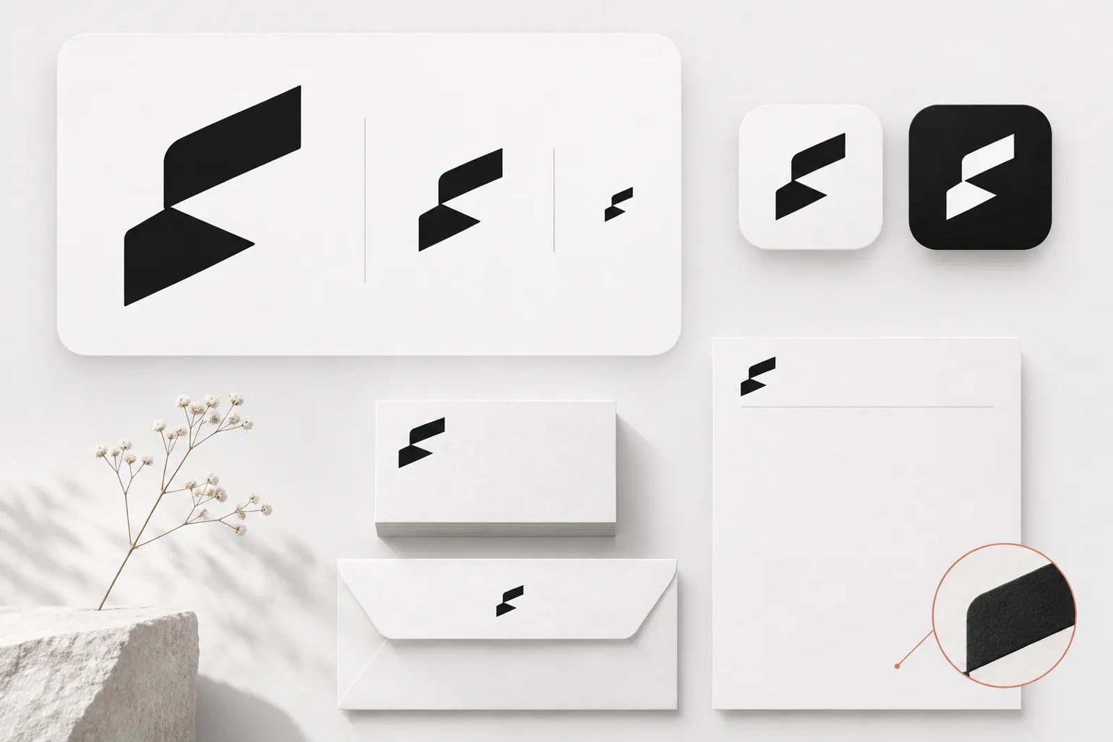
A contemporary logo must remain recognizable in a tiny browser tab, a short video, a dark interface and a printed package. These practical demands help explain the directions emerging for 2027. Increasingly, a logo is developed as a coordinated family of forms and behaviors, working with typography, color and sometimes sound, rather than as one fixed drawing.
This guide explores twelve logo directions for 2027, including where each fits, what can go wrong and how to test it. It also provides a practical design process, a system checklist and a way to begin visual exploration with Saharan AI.
One honest note before we start. The 2027 editions of the major logo trend reports are not out yet, so this guide reads the signals that are already public: the 2026 trend reports, the rebrands of 2025 and the practical demands of the screens and formats logos now live on. Where a point comes from a 2026 report or a 2025 rebrand, it is labelled that way. Trends are not rules, and a forecast is only useful if it helps you make better decisions for a specific brand.
If you want the wider picture beyond logos, our hub on graphic design trends 2027 covers color, layout, illustration and type across every medium.
How this list was built
For published historical context, consult LogoLounge’s trend reports. The twelve directions below are an editorial synthesis, not a claim that these are the categories in a published 2027 report.
This guide builds its discussion from three types of checkable evidence. A direction was included only when it appeared in more than one of them.
The first kind is published trend research. The LogoLounge 2026 Trend Report, led by Bill Gardner, identified fifteen trends from more than 30,000 logos observed over the previous year, and motion was its main overarching theme (Dieline). Gardner described designers as becoming "architects of possibilities" (GDUSA). Commentary on the same report noted a growing divide between designers who experiment with new approaches and those who refine existing styles (Feedbagel). Other 2026 trend round-ups from design platforms and studios pointed in compatible directions, which we cite as we go.
The second kind is real rebrands. Big companies rarely change their logos for fashion. When they do change, they are usually solving a practical problem: too many sub-brands, a mark that breaks at small sizes, a name that no longer fits what the company does. The 2025 rebrands discussed in this guide are useful because the reasoning behind them is often public.
The third kind is the environment itself. Browser tabs, app icons, dark mode, vertical video and automated asset production all put constraints on what a logo can be. Those constraints do not care about taste, and they shape trends more than any single designer does.
What we left out matters too. We did not include anything we could only find in one unsourced listicle, and we did not invent adoption percentages. When you read "brands are doing X" here, it means there are public examples or published research behind it, not a survey we made up.
The big picture: from a mark to a system
The underlying shift is from delivering a few static lockups to defining a flexible identity system. A logo project now often needs to specify motion, small-size simplification, light and dark treatments, and relationships with the brand's type and color. These behaviors extend the role of the traditional logo file.
The LogoLounge 2024 report already captured this. Gardner observed that brands were starting to rely less on the logo as the primary identifier and more on other elements such as colors, wordmarks and sound (Dieline). Creative Review put it plainly: the logo used to be the centerpiece of a visual brand, but it is now common to see it take a back seat to other elements in the graphic family (Creative Review).
That does not make the logo less important. It makes it more connected. A logo in 2027 succeeds when it works as the anchor of a system, not when it tries to carry the whole brand alone. Almost every trend below is a different answer to the same question: how should a mark behave when it has to live in many places at once?
1. Motion-native marks
What it is. A motion-native mark includes movement in its original concept. Its assembly, rotation, rhythm or final resolution is designed alongside the static form. The version used on stationery can be understood as one resolved state within that broader identity.
Why now. Motion was the main overarching theme of the LogoLounge 2026 report (Dieline). A 2025 creative trends report described brands weaving motion into their DNA "not as an afterthought but as a foundational part of their identity" and pointed to the Natural History Museum's identity, which turns a formation found in nature into an adaptive motion system (Creative Spark). The reason is simple: more brand impressions now happen inside video, in app transitions and on screens that refresh constantly, so a logo that only knows how to sit still is underusing its biggest moments.
When to use it. Motion-native thinking pays off for brands that live mostly on screens: apps, media brands, consumer tech, entertainment and any company whose customers meet it first in a feed or a video. It is also strong for brands with a story of transformation, because movement can express change better than any static shape.
When to avoid it. If most of your brand's appearances are physical and static, such as packaging, signage or print, motion should stay a supporting layer, not the core of the idea. It is also a poor fit if your team cannot produce and maintain motion assets; a beautiful animation that only exists in the launch video does not make a motion-native brand.
How to execute it. Start the logo sketching phase with movement verbs rather than shapes: unfold, stack, orbit, reveal, breathe. Decide which single motion best expresses the brand and design the static mark as the resting state of that motion. Define three durations, such as a short sting for social clips, a longer reveal for brand films and a micro-interaction for app loading states. Write down what never changes, for example the final resting position and the color at rest, so every animator lands in the same place.
Example in words. Picture a logistics company whose mark is three parallel bars. In motion, the bars slide in from different directions at slightly different speeds and lock together, which says "many routes, one delivery" without a single word. The static logo is simply the locked position. On a loading screen, only the last bar slides in, so the motion survives even at the smallest size.
2. Responsive logo families
What it is. A responsive logo family provides related designs for different amounts of space. A full lockup serves larger applications, a simplified arrangement handles medium ones, and a distinctive symbol or letter works at the smallest sizes. Each is deliberately designed for its context.
Why now. Secondary commentary on the 2026 trend reports highlights responsive variants and modular construction among the strongest directions (Inkbot Design). Another 2026 analysis describes logos working as systems that adapt across platforms, citing Google's "G," which flexes across products, motion states and screen sizes while remaining instantly recognizable (ManyPixels). The practical driver is the range of sizes a mark must survive, from a tab icon to a building sign.
When to use it. Almost every brand benefits from a responsive family. It is essential for digital products, multi-brand companies and any business whose logo includes a long name, a tagline or fine detail that disappears at small sizes.
When to avoid it. The only reason to resist is when a brand's equity depends on a single, unchangeable lockup and the team cannot police the use of multiple versions. Even then, you usually need at least a small-size icon; the question is how far to go, not whether to start.
How to execute it. Design from the smallest size up. Ask what the brand looks like at sixteen pixels and work outward to the full lockup, so the smallest version is a deliberate choice, not a leftover. Define breakpoints in your guidelines, the way a website defines layout breakpoints, and say which version appears at each. Keep one constant across all versions, such as a specific curve, a color or a letterform, so people recognize the family even when most of it is missing.
Example in words. A bakery called "Hearth and Grain" might have a full lockup with an illustrated loaf above the name, a horizontal version with a simplified loaf beside the name for menus and a single rounded "H" whose crossbar is shaped like a loaf for app icons and stamps. The loaf curve appears in all three, which is what ties the family together.
3. Custom typefaces and sharper wordmarks
What it is. A custom or substantially modified typeface can give a wordmark its own recognizable details. The same typographic choices then extend that identity into headlines, labels and interfaces, creating a more coherent brand system.
Why now. Sharper wordmarks feature among the strongest 2026 directions in trend commentary (Inkbot Design). Several high-profile 2025 rebrands made custom type central. PepsiCo's new corporate identity, unveiled on October 29, 2025, uses a custom rounded typeface developed with Studio Mega and PepsiCo's in-house design team (Food Business News). A 2025 rebrand round-up reported that Amazon introduced a custom typeface called Ember Modern to bring consistency across its sub-brands, and that Domino's introduced a custom font called Domino's Sans (Storyboard18). When a company has dozens of products, a shared typeface does more to hold the brand together than any symbol can.
When to use it. Custom type is worth it for brands with many sub-brands, heavy text use in interfaces or a name that carries more recognition than any symbol. Smaller brands can get much of the benefit by customizing a few characters of a licensed typeface for the wordmark and using the base family everywhere else.
When to avoid it. A full custom typeface is a long project and a long-term maintenance commitment. If the brand is still searching for its positioning, commit to a well-chosen licensed family first and customize later.
How to execute it. Identify the two or three letters that appear in the brand name and in most headlines, and give them a distinctive detail that still reads at small sizes. Test the wordmark in all caps, lowercase and title case before you decide. Check the typeface in the languages the brand actually uses; a beautiful Latin custom face can fall apart if the brand also needs Japanese, Chinese or Cyrillic text.
Example in words. A fintech brand named "Lumen" might keep a clean sans-serif base but cut the stroke of the lowercase "e" at an angle that echoes a rising chart line. The angle appears in the wordmark, in the app's numerals and in the headline font, so the brand is recognizable even in a screenshot with no logo in it.
4. Softer, lowercase wordmarks
What it is. Lowercase forms, rounded terminals and gentler letter shapes offer an alternative to hard-edged capitals. The intention is an approachable identity that remains mature and distinctive.
Why now. The clearest public example is PepsiCo's 2025 corporate identity: reporting describes a lowercase wordmark set in rounded custom letters, replacing the company's previous all-caps corporate name, alongside the tagline "Food. Drinks. Smiles." (Food Business News; PotatoPro). The broader reason is that brands increasingly talk to people directly, in apps and messages, and a softer wordmark fits a conversational voice. Trend commentary also describes "warmer minimalism" as a 2026 direction (Digital Synopsis).
When to use it. Consumer brands, food and beverage, wellness, education and any company trying to close the distance between itself and its customers. It also helps corporate parent brands that want to look less institutional.
When to avoid it. Lowercase and rounded letters can undercut authority in categories where trust depends on seriousness, such as law, security, heavy industry or some financial services. If you go softer in these categories, keep the structure strict and let only one or two details carry the warmth.
How to execute it. Soften one variable at a time. Start with case, then terminals, then letter spacing, and stop as soon as the wordmark feels approachable. Check that the lowercase letters keep distinct silhouettes at small sizes; rounded lowercase letters can blur together. Pair the softer wordmark with a confident color or symbol so the overall identity still feels decisive.
Example in words. A home insurance company might move from a tightly spaced all-caps wordmark to lowercase letters with gently rounded ends, while keeping a strong, flat blue and a simple house-shaped symbol. The wordmark says "we are easy to talk to," and the color and symbol say "we are still dependable."
5. Human texture and deliberate imperfection
What it is. Hand-drawn lines, ink texture, slightly uneven letterforms and visible traces of making are showing up in logos as a counterweight to perfectly smooth digital geometry.
Why it matters. Hand-drawn texture can create a sense of care and a recognizable human touch. Use it when that character supports the brand story, and check that the texture still reproduces clearly at small sizes.
When to use it. Craft brands, food and hospitality, independent retail, creative studios, nonprofits and personal brands. It also works as a secondary layer for larger brands, such as a hand-drawn version of the mark used for seasonal campaigns.
When to avoid it. Texture is fragile at small sizes and in single-color printing. Avoid it as the only version of the logo for brands that need tiny icons, embroidery, engraving or very low-cost printing. Also avoid fake imperfection that looks like a filter; people notice when the texture is applied rather than made.
How to execute it. Draw the mark by hand first, then decide how much of the irregularity to keep in the vector version. Keep texture in the outline or a few strokes rather than across the whole mark. Build a clean, simplified version for small sizes and keep the textured version for places where it can be seen properly.
Example in words. A small coffee roaster might use a wordmark traced from a brush-pen drawing, with the slight wobble of the hand left in the curves of the letters, and a clean coffee-bean icon for the app and the bag seal. The textured wordmark appears large on the bag front and the shop sign, where the detail can be appreciated.
6. Mascots and character warmth
What it is. Characters, from simple faces to full mascots, are returning as part of brand identities, often as a companion to the main logo rather than a replacement for it.
Why now. Mascot warmth is listed among the 2026 directions in trend commentary (Inkbot Design). Characters work well in the formats that dominate attention today: stickers, short videos, chat interfaces and app onboarding. A character can react, speak and change expression, which a static symbol cannot.
When to use it. Consumer apps, games, education, food, kids' brands and any product where the brand talks to the user in an interface. Characters are also useful for B2B brands that want to explain complex products in a friendly way.
When to avoid it. A mascot is a long-term commitment with its own personality, poses and rules. Avoid it if the brand cannot keep the character consistent across many artists and formats, or if the category demands restraint.
How to execute it. Design the character from simple shapes that echo the main mark, so the two feel related. Define a small set of expressions and poses before launch, and write rules for what the character never does. Decide where the character appears and where only the logo appears.
Example in words. A language-learning app might pair a clean wordmark with a small round character whose eyes are two dots taken from the wordmark's letterforms. The character celebrates finished lessons and appears in reminder messages, while the logo alone appears on the app icon and the website header.
7. Naive drawing and type collage
What it is. Two related directions: naive drawing, which uses deliberately simple, almost childlike lines, and type collage, which combines different typefaces, cut-outs and textures in one composition.
Why it matters. Naive drawing and type collage can introduce personality into an identity. They work best when their irregularity is deliberate and the resulting mark remains identifiable across different placements.
When to use it. Fashion, music, events, publishing, independent food brands and youth-focused products. Type collage works especially well for campaigns and packaging where there is room for a rich composition.
When to avoid it. These styles date quickly and can look chaotic in small or functional placements. Avoid them for the core mark of brands that need decades of stability; use them in campaign layers instead.
How to execute it. Keep a stable core, such as a clean wordmark, and let the naive or collage elements live around it. Limit the collage palette to a few typefaces and textures that you can reuse. Design for the smallest placement first so the core still works when the collage is stripped away.
Example in words. A music festival might keep a simple bold wordmark and build each year's poster from a collage of cut-out letters, hand-drawn stars and photocopied textures around it. The festival is recognizable from the wordmark; the collage tells you which year you are looking at.
8. Heritage revival
What it is. Brands are reaching back into their own archives for scripts, emblems or details from earlier eras and bringing them forward with modern craft.
Why now. A 2025 rebrand round-up reported that La-Z-Boy moved from a minimal wordmark it had used since 2003 to a script wordmark drawing on the company's 1927 roots, paired with nature-inspired colors (Storyboard18). Heritage gives a brand something that competitors cannot copy: its own history. After years of similar minimal wordmarks, an authentic historic detail stands out.
When to use it. Companies with real history, regional brands, family businesses and categories where trust and continuity matter, such as furniture, food, hospitality and crafts.
When to avoid it. Do not invent heritage you do not have. If the brand is new, borrowing a vintage look without a story behind it tends to feel like a costume. Also avoid copying an old mark exactly; it usually needs redrawing to work on screens.
How to execute it. Start with an archive review: old packaging, signage, letterheads and photographs. Pick one element with a story, then redraw it with modern spacing, weights and screen performance in mind. Explain the reference in the brand guidelines so the team understands why it matters.
Example in words. A regional dairy founded decades ago might find a hand-lettered script on an early delivery truck in its archive. The redrawn script becomes the wordmark, cleaned up for small sizes, while a simple cow-head symbol from the same period becomes the app icon.
9. Color as a primary identifier
What it is. Brands are treating a specific, saturated color as a central part of their identity, sometimes as recognizable as the mark itself, and adjusting their logos so that color can do more of the work.
Why now. The LogoLounge 2024 report already noted brands leaning on colors and other elements beyond the logo (Dieline). In 2025, a rebrand round-up reported that Amazon gave its smile a deeper curve and a more saturated orange, and that Domino's moved to brighter reds and blues (Storyboard18). On crowded screens, a confident color is often recognized before any shape.
When to use it. Brands in crowded categories, consumer apps that compete on a home screen and retail brands where packaging must be spotted from a distance.
When to avoid it. If your category is dominated by one color, owning it is hard; choose a distinct color instead of fighting for the same one. Also think about accessibility: a color-led identity still needs enough contrast for text and icons.
How to execute it. Define the brand color precisely for screen, print and dark mode, because a saturated color can look very different on each. Test it next to the main competitors in your category. Write rules for how much of the color appears in each format so it stays distinctive without becoming tiring.
Example in words. A plant-care app might own a specific, slightly warm green across its icon, buttons and packaging, with a very simple leaf mark. On a phone's home screen, the green square with a white leaf is recognized before anyone reads the name.
10. Small-size first: favicons, app icons and dark mode
What it is. Logo design that starts with the smallest and most constrained placements: browser tabs, app icons, notification badges, smartwatch faces and dark-mode interfaces.
Why now. Trend commentary points to small sizes, dark mode and app icons as pressures shaping logo trends, because a mark has to hold up at tiny scale (Inkbot Design). Practical favicon guidance recommends testing icons on both light and dark browser backgrounds, using an SVG favicon that switches its colors under the dark color-scheme setting, and checking app icons separately because platforms apply backgrounds and masks differently (DEV Community; 30 seconds of code). A dark logo on a dark tab can almost disappear, which is a branding problem even if nobody writes about it.
When to use it. Every brand with a website or an app, which today means nearly every brand.
When to avoid it. There is no case for ignoring small sizes. The only judgment call is how much the small-size version should differ from the main mark.
How to execute it. Design the icon in a square and in a circle, on light and on dark backgrounds, before you finalize the main mark. Prepare a light-mode and a dark-mode version of the favicon. Remove thin strokes and fine detail from small versions instead of hoping they survive. Check the icon inside real interfaces, such as a browser tab bar and a phone home screen, not just on a blank artboard.
Example in words. A project management tool with a detailed geometric logo might create a small-size version that keeps only a bold diagonal stroke from the main mark, with a white version for dark mode. In a crowded tab bar, that stroke is still recognizable when the full logo would have become a blur.
11. Digital-native precision and pixel references
What it is. Marks that embrace the grid of the screen: pixel-based shapes, crisp geometric construction and details designed to snap cleanly to digital sizes.
Why now. Pixel-sharp precision appears in 2026 trend commentary alongside the more human directions (Inkbot Design). It is the other side of the same divide noted in the LogoLounge 2026 coverage, where some designers experiment and others refine (Feedbagel). Technology, gaming and developer brands use pixel references to speak directly to digital culture.
When to use it. Software, gaming, developer tools, digital media and brands whose audiences grew up with screens.
When to avoid it. Pixel styles can read as retro or as a novelty. Avoid them for brands that need to feel physical, premium in a traditional sense or timeless.
How to execute it. Build the mark on a grid that matches common icon sizes so it renders crisply. Decide whether the pixel look is the core identity or a secondary layer for campaigns. Pair it with a clean typeface so the identity does not become a costume.
Example in words. A game studio might build its symbol from a small grid of square blocks forming the first letter of its name. At large sizes, the blocks have subtle depth; at icon size, they render as pure squares that look sharp on any screen.
12. Confident simplicity, not safe sameness
What it is. A push back against generic minimalism. The goal is a simple mark with one clear, ownable idea rather than a neutral sans-serif wordmark that could belong to anyone.
Why it matters. Simplification is only useful when the remaining details are distinctive. An effective identity can be restrained and still communicate a particular character through proportion, rhythm and unusual letterforms.
When to use it. Any brand that wants a clean identity without disappearing into its category.
When to avoid it. Simplicity is almost always right; what to avoid is simplicity without an idea. If you cannot describe what makes your simple mark different in one sentence, it is probably too generic.
How to execute it. Write the single idea the mark should express before drawing anything. Put your draft next to the logos of your closest competitors and ask whether it could swap places with any of them. Keep one distinctive detail, such as an unusual letter join, a specific angle or a hidden symbol, and protect it in every version.
Example in words. An accounting firm might use a simple wordmark where the two letters "t" share a single crossbar, quietly suggesting balance. It is as simple as any competitor's logo, but nobody else has that detail.
Trends to treat carefully in 2027
Not every visible direction is a good bet. A few patterns are worth extra caution.
Gradients without a reason. Gradients can add depth and energy, but a gradient that only exists because it looks modern will date quickly and often fails in one-color printing, embroidery and small icons. If you use one, make sure the mark also works in a flat version.
Interchangeable geometric marks. A circle, a square and a slash arranged neatly can look polished on a presentation slide and still be forgettable. Simple geometry needs a specific idea behind it.
Over-complex motion. Motion is a strong direction, but long, complicated animations rarely survive real use. Most brand impressions are short; design the shortest version first.
Copying a famous rebrand. When a well-known company changes its logo, similar logos appear for months afterward. The reasoning behind a rebrand belongs to that company's situation; the visual result rarely transfers.
A practical logo design process for 2027
Trends only help if they feed into a solid process. Here is a process that reflects how logos are actually used now, from research through to a working system.
Step 1: Write the brief as decisions, not adjectives
A brief full of words like "modern, bold and friendly" does not help anyone choose between two directions. Write down the decisions the logo needs to support: who the main audience is, where people will meet the brand first, which competitors it must stand apart from, which languages it must work in and which formats matter most. Add the one idea the brand should own. This becomes the yardstick for every review.
Step 2: Audit where the logo will live
List every placement the logo must survive: website header, browser tab, app icon, social profile picture, video intro, packaging, signage, merchandise and documents. Note the smallest size, the background colors and whether the placement moves. This list is the real specification for the design.
Step 3: Research the category and the references
Collect logos from your category and adjacent ones, along with references from outside the category that express the idea you want. Group them by approach so you can see where the category clusters and where there is room. Save the sources so you can explain later why a direction was chosen.
Step 4: Explore broadly before choosing
Sketch or generate many directions quickly, covering different approaches: symbol-led, wordmark-led, character-led, motion-led. The aim of this stage is range, not polish. Remove directions that do not express the brief's single idea.
Step 5: Shortlist three distinct directions
Pick three directions that are genuinely different, not three versions of the same idea. Present them in context, on the real placements from Step 2, rather than on blank backgrounds. Context reveals problems that artboards hide.
Step 6: Stress-test the favorite
Take the strongest direction and test it at the smallest size, in one color, on dark backgrounds, in motion and next to competitors. Fix what breaks. A logo that passes these tests is far more valuable than one that only looks good large.
Step 7: Build the family
Design the responsive versions: full lockup, horizontal lockup, compact version and icon. Define the constant element that ties them together and the breakpoints at which each version appears.
Step 8: Define motion and color behavior
Specify how the mark animates in, how long each animation lasts and where it ends. Define the color values for screen, print and dark mode. Write down what never changes.
Step 9: Write short, practical guidelines
Guidelines that nobody reads protect nothing. Keep them short and visual: the versions, the breakpoints, the clear space, the colors, the motion rules and a few examples of correct and incorrect use.
Step 10: Review after launch
After the logo has been in use for a while, review real placements. Look for versions that are misused, sizes that fail and places where the system needs another variant. A logo system improves through use.
Logo system checklist for 2027
For web delivery, MDN’s SVG documentation explains the vector format. Confirm that the final file contains the intended artwork rather than assuming a raster preview is a finished vector asset.
Use this checklist before calling a logo project finished.
- The single idea of the mark can be described in one sentence.
- There is a full lockup, a horizontal lockup, a compact version and an icon.
- The icon has been tested in a browser tab and on a phone home screen.
- There are light-mode and dark-mode versions of the icon and favicon.
- The mark works in one color for stamps, embroidery and engraving.
- The wordmark has been checked in every language the brand uses.
- Motion has a short version, a long version and a defined resting state.
- Brand colors are defined for screen, print and dark mode, with accessible contrast for text.
- The constant element that ties the family together is written down.
- Guidelines show correct and incorrect use with real examples.
How to brief a 2027 logo project
A good brief is the fastest way to make trends useful instead of distracting. Whether you are briefing a designer, a studio or an AI design agent, the same structure works. Here is an example brief for a fictional brand, written the way we recommend.
Brand: Northline, a subscription service that delivers repair kits for outdoor gear.
The one idea: "Keep your gear going." The logo should suggest repair, durability and the outdoors without looking like a hardware store.
Audience and first contact: Hikers and campers who mostly meet the brand through short videos and Instagram posts, then subscribe on a phone.
Placements that matter most: App icon, social profile image, short video intros, the box lid, a woven patch sewn onto repaired gear and the website header.
Competitors to stand apart from: Outdoor brands that use mountain silhouettes and rugged serif type. Northline should not add another mountain.
Constraints: Must work as a one-color woven patch, must read at app-icon size, must work on dark backgrounds because many outdoor photos are dark.
Trends to consider: Responsive family (the patch and the app icon are very different sizes), human texture (repair is hands-on work), motion-native thinking for the video intro.
Trends to avoid: Gradients (the patch cannot reproduce them), collage (too busy for the core mark).
Deliverables: Three distinct directions in context on the placements above, then a full family for the chosen direction: lockup, horizontal lockup, compact mark, icon, patch version and a short motion sting.
Notice what the brief does not say. It does not ask for something "modern and bold." It tells the designer where the logo will be judged and what it must survive, and it names which trends are worth exploring for this brand and which are not. A brief like this makes a review meeting much easier, because every option can be checked against the same list.
Use the same decision-led brief when exploring a direction in Saharan AI. Include the brand context, intended applications and the qualities you want to preserve. Keep an explicit record of approved choices for future work.
Applying trends by format
The same trend can be right in one format and wrong in another. Thinking format by format keeps a trend from taking over places where it does not belong.
Digital products. In apps and web products, small-size-first design and responsive families come first, because the icon and the header do most of the work. Motion belongs in loading states and onboarding, kept short so it never slows the user down. Color as an identifier matters on the home screen, where the icon competes with dozens of others.
Social and video. On social platforms, the profile image is a circular crop at a small size, so the icon version has to work inside a circle. Video intros are where motion-native marks earn their keep; a two-second sting that resolves to the logo is often more valuable than a long animation. Mascots work well in stickers and short clips because they can react and change expression.
Packaging. On a shelf, color and a confident mark are recognized before any detail. Human texture and heritage details can work well on packaging because the size is generous and people look closely. Remember that packaging often prints in limited colors on varied materials, so the one-color version has to be strong.
Print and signage. Large signage can carry detail and texture that would disappear on screen, but signs are also seen from a distance and at angles. Test the mark at the viewing distances that matter, not only on a screen.
Merchandise and physical goods. Embroidery, engraving and woven patches strip away fine lines and gradients. A logo family should include a version designed for these processes rather than leaving it to the manufacturer to simplify.
Documents and presentations. Here the wordmark does most of the work. A custom or carefully chosen typeface pays off because the brand appears in every heading, even when the logo is small or absent.
Common mistakes when applying logo trends
Trends go wrong in predictable ways. Watching for these mistakes saves time and money.
Choosing a trend before the problem. Starting from "we want a motion logo" instead of "our brand is mostly seen in video" leads to work that looks current but does not help the business. Always connect a trend to a real need from the brief.
Applying a trend to the whole identity. A collage style, a pixel reference or a hand-drawn texture is often best as a layer around a stable core, not as the core itself. When the entire identity depends on a fashionable style, the whole thing dates at once.
Forgetting the smallest size. Many logos are approved at large sizes on clean artboards and only tested in a browser tab after launch. By then, fixing the problem means reopening the project.
Skipping the one-color version. Gradients, textures and multiple colors look rich on screen and fail on stamps, embroidery and low-cost printing. Make the one-color version part of the approval.
Copying the surface of a famous rebrand. A big company's new logo solves that company's specific problems. Borrowing its look rarely helps a different brand and often makes it look like a follower.
Writing guidelines nobody reads. A long guideline document that sits in a shared drive protects nothing. Short, visual guidance with clear examples of correct and incorrect use is far more likely to be followed.
How to tell whether a new logo is working
You do not need invented benchmarks to judge a logo. A few practical checks over the first months after launch tell you most of what you need to know.
Recognition at small sizes. Look at the logo where it actually appears small: browser tabs, notification badges, social profile images. If people on your team have to squint to recognize it, the small-size version needs work.
Consistency in the wild. Collect real placements from your website, social accounts, partners and printed materials. Count how often an outdated or incorrect version appears. Frequent misuse usually means the guidelines are unclear or the right files are hard to find.
Ease of production. Ask the people who make assets every day whether the system helps or slows them down. If they keep inventing their own variants, the family is missing a version they need.
Fit with the brand's voice. Read the brand's recent messages and look at the logo beside them. If the voice is conversational and the logo is stiff, or the voice is serious and the logo is playful, one of them needs to move.
Holding up next to competitors. Place the logo in a lineup with your closest competitors at a small size. If it blends in, the ownable detail is not strong enough.
Choosing trends by industry
Trends land differently in different categories. Here is how to think about them for a few common cases.
Startups and software. Responsive families, small-size-first thinking and confident simplicity matter most, because the logo will mostly live in tabs, app icons and product interfaces. Motion is worth defining early if the product has onboarding or loading moments. See our startup logo design page for more.
Food, restaurants and hospitality. Human texture, heritage revival and softer wordmarks fit categories built on warmth and trust. Make sure the textured versions have clean small-size counterparts for delivery apps and receipts. See restaurant logo design.
Real estate and professional services. Confident simplicity and precise wordmarks fit categories that depend on credibility. Softness should come from one detail, not the whole identity. See real estate logo design.
Consumer apps and games. Mascots, motion-native marks and color as a primary identifier all help a brand stand out on a crowded home screen.
Fashion, music and events. Naive drawing and type collage work well as campaign layers around a stable core mark.
FAQ
What are the biggest logo design trends for 2027?
Based on the 2026 trend research and recent rebrands, the strongest directions are motion-native marks, responsive logo families, custom typefaces and sharper wordmarks, softer lowercase wordmarks, human texture, mascots, naive drawing and type collage, heritage revival, color as a primary identifier, small-size-first design, digital-native precision and confident simplicity. The common thread is that logos are becoming systems rather than single files.
Are 2027 logo trend reports already published?
At the time of writing, the 2027 editions of the major logo trend reports were not yet published. This guide uses the signals that are public, mainly the LogoLounge 2026 Trend Report, other 2026 trend reports and the 2025 rebrands, and labels them as such.
Should I redesign my logo to follow 2027 trends?
Usually not just to follow a trend. Redesign when the current logo fails a real need, such as breaking at small sizes, not working in dark mode, not covering new products or no longer matching what the company does. Trends can then guide how you solve that problem.
How do I make my logo work at small sizes?
Design the smallest version first, remove thin strokes and fine detail, test it in a browser tab and on a phone home screen, and prepare light-mode and dark-mode versions of the favicon and app icon.
What is a responsive logo?
A responsive logo is a family of versions that adapts to the available space: a full lockup where there is room, a simplified version in medium spaces and a compact icon in the smallest spaces, all tied together by a constant element.
Can AI help me design a logo?
AI-assisted exploration can help develop visual alternatives from a clear brief. In Saharan AI, start with the intended audience, brand character and required applications. The final judgment, precise drawing and production checks remain part of the design process; verify the file options available in your project.
How many logo versions do I need?
Most brands need at least four: a full lockup, a horizontal lockup, a compact version and an icon, each in light and dark variants and a one-color version.
How long will a logo trend last?
There is no reliable answer. Practical trends that solve real constraints, such as small-size-first design and responsive families, tend to last. Purely stylistic trends, such as particular gradients or collage styles, date faster and are better used in campaign layers.
From visual direction to finished creatives
Saharan AI offers both hands-on exploration and direct delivery of finished creatives. For identity work, define which applications, file requirements and refinement steps are included in the commission. That gives the project a clear route from an interesting direction to the agreed finished assets.
Explore the direction before committing to the system
Bring your audience, positioning and key applications into a concise brief. Saharan AI offers a starting point for creative exploration and a route to professional creative production when the project needs specialist refinement.
Start your brand-direction project in Saharan AI, compare a few distinct ideas and test the preferred direction in real applications before preparing the final identity files.
Where creative vision is brought to life
Matched in 24h. Delivered by professionals.
50+ AI models. One creative workspace.