
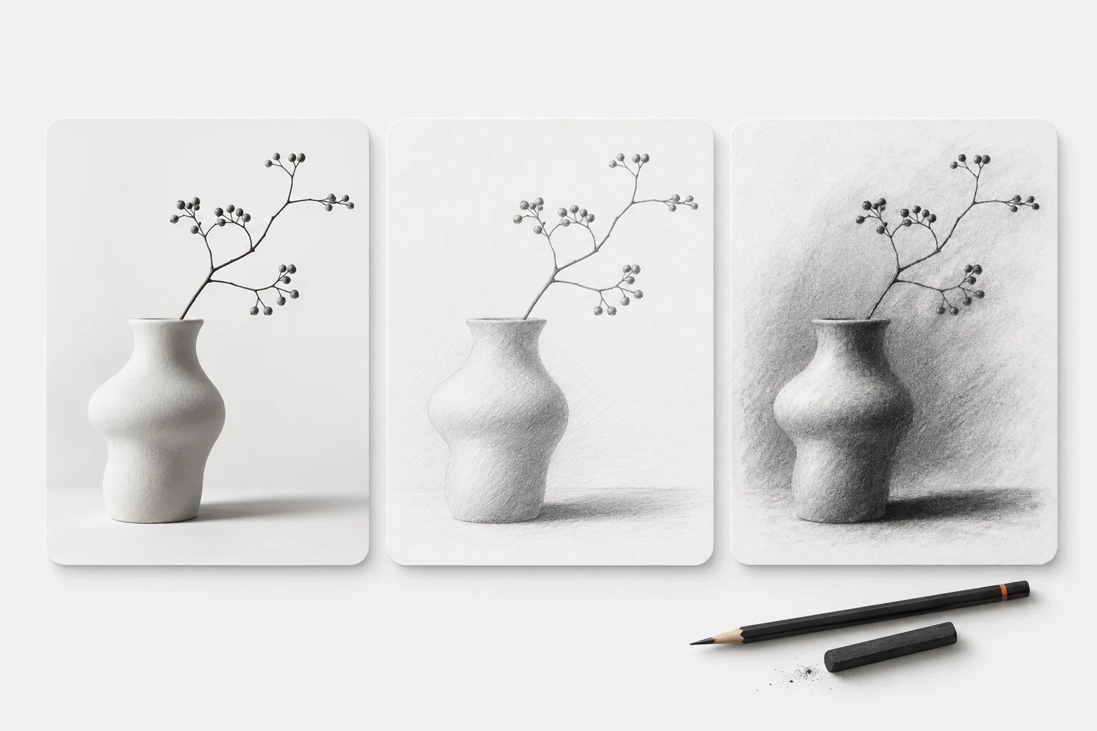
A sketch treatment can turn a familiar subject into a different kind of visual story. Pencil suggests precision and softness; charcoal creates weight and atmosphere; ink gives shapes a clear graphic presence. The best starting point is to choose what the drawing needs to communicate before asking for a style.
This guide explains how to prepare a sketch brief for a creative project in Saharan AI. The examples are creative directions to explore, not a promise of a dedicated one-click photo-to-sketch control.
Choose a source image with a clear subject
Look for a readable silhouette, useful separation from the background and enough visible detail to identify the subject. A clean image of a single product is easier to evaluate than a busy scene where several objects overlap.
Decide what must stay faithful to the reference. For a portrait, that may be facial proportions and expression. For packaging, it may be the container shape and label placement. For an architectural subject, it may be perspective and the relationship between major forms.
Keep a copy of the source and the brief together. If the result drifts, you can identify whether the problem is the subject, the composition or the style instruction.
Four sketch directions to consider
Pencil
Use a pencil direction when the image needs delicate contours, gradual shading and a quiet editorial feel. Describe whether the finish should be a loose study or a more resolved drawing. Specify how much paper should remain visible.
Charcoal
Charcoal suits a more dramatic interpretation with broad tonal areas and a tactile surface. Ask for a clear focal point so the shadows do not swallow the subject. Check whether the result remains readable at the size where it will be used.
Pen and ink
Ink works well for strong outlines, graphic contrast and controlled negative space. Define whether the marks should be spare and continuous or built from many short strokes. Avoid asking for minimal linework and dense shading at the same time.
Cross-hatching
Cross-hatching uses overlapping line directions to suggest tone. It can give an object a detailed, crafted character, but dense marks may become muddy when reduced. Test the drawing at its final placement size before committing to the treatment.
Describe detail and shading separately
Line detail and tonal weight are different choices. A drawing can have precise outlines with very little shading, or loose contours with deep shadows. Make both decisions explicit.
Develop an editorial pencil-study direction for this ceramic vase. Preserve its silhouette and the arrangement of the branch. Use fine graphite contours, light shading and a visible paper texture. Keep the background open and avoid adding decorative objects.
Change one part of the instruction at a time when evaluating a result. If you alter the style, viewpoint and background together, it becomes harder to tell which change improved the image.
Check the result as an image, not just an effect
- Does the subject still have the right proportions?
- Are edges and small features intentional rather than accidental?
- Does the darkest area support the focal point?
- Can the image be cropped for its intended placement?
- Will a reader understand the subject without relying on a large caption?
A successful sketch should do more than place texture over a photograph. Its mark-making, tonal structure and empty space should work together as a coherent image.
Prepare the output for its destination
A cover image, printed card and small social tile impose different requirements. Decide the intended dimensions and crop early. Review the final file at actual viewing size and, for print, confirm the production requirements with the printer.
When publishing informative sketches online, consult the W3C guidance on image descriptions. Explain the useful content of the image rather than listing every mark on the paper.
Keep reference rights separate from visual style
Record where your source material came from and what use it permits. A new visual treatment is not a substitute for understanding the source image's terms. For historical reference research, the Library of Congress Free to Use and Reuse collection offers a useful starting point; read the relevant item information before using a specific asset.
Frequently asked questions
Which style should I try first?
Use the communication goal as the starting point: pencil for a quiet study, charcoal for tonal emphasis, and ink for graphic clarity. Compare a small number of distinct directions.
Why does the result look too busy?
The brief may request too much detail, or the reference may have an overcrowded background. Simplify the subject and specify where shading should stop.
Can a sketch be used in a brand campaign?
It can be a useful creative direction when its visual character fits the brand. Confirm source permissions, output requirements and final accuracy for the particular project.
Choose exploration or finished creative delivery
You can use Saharan AI to explore a sketch-led direction yourself, or commission finished creatives built around the brief. Specify the source subject, drawing treatment, destination and approval criteria so the delivered work matches the intended use.
Explore a sketch-led direction
Choose one subject and one drawing treatment, then open a new Saharan AI project with a focused brief. Judge the result against the communication goal before expanding it into a series.
Where creative vision is brought to life
Matched in 24h. Delivered by professionals.
50+ AI models. One creative workspace.